

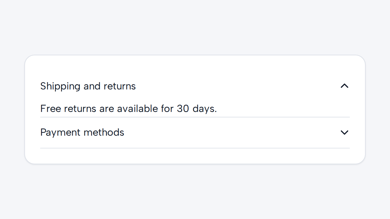
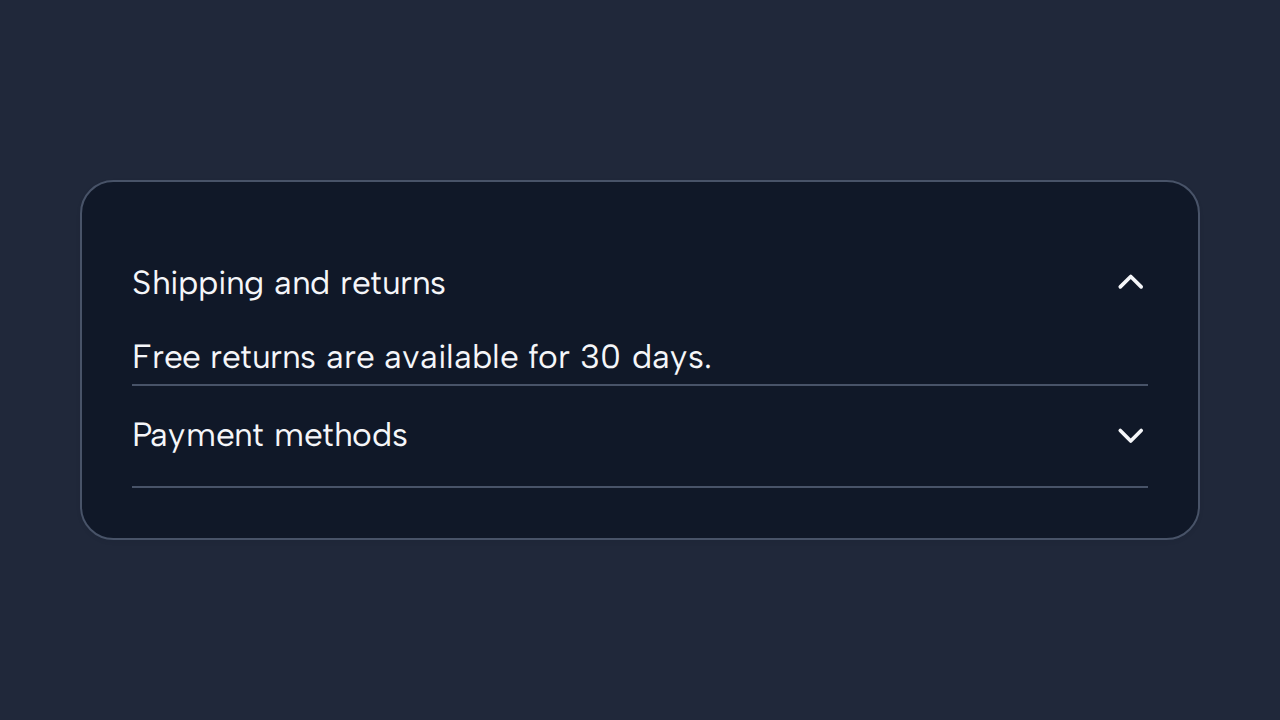
Do
Write descriptive summaries
Use concise summaries that tell people what each item will reveal before they expand it.
aidsgn-accordion groups aidsgn-accordion-item sections. Author each native details and summary descendant yourself; set open on both the host and details to expand an item initially.
<aidsgn-accordion><aidsgn-accordion-item summary="What is aidsgn?" open> <details class="aidsgn-accordion-item__details" open> <summary class="aidsgn-accordion-item__summary"><span class="aidsgn-accordion-item__summary-label">What is aidsgn?</span><svg class="aidsgn-accordion-item__chevron" viewBox="0 0 16 16" aria-hidden="true"><path d="m3 6 5 5 5-5" fill="none" stroke="currentColor" /></svg></summary> <div class="aidsgn-accordion-item__panel"><div>A native Web Component design system with DTCG tokens.</div></div> </details></aidsgn-accordion-item></aidsgn-accordion>Multiple sections may be open. Each item uses native details and summary semantics; a decorative chevron rotates with the state while collapsed panels animate using a grid transition. Both animations are removed for reduced-motion preferences, and native open and closed state changes immediately. Use it for related optional detail, not for essential content users must discover to complete a task.
Use concise summaries that tell people what each item will reveal before they expand it.
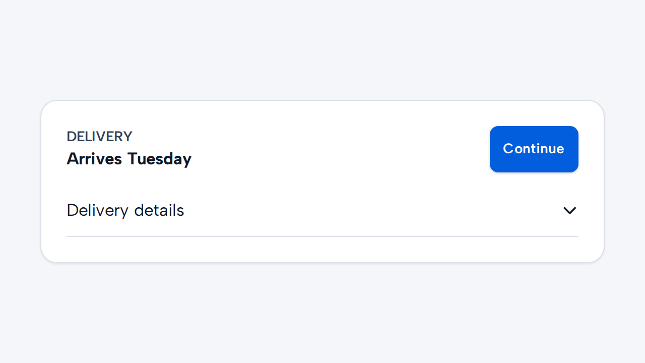

Present information elsewhere when people must see it without first interacting with a disclosure.
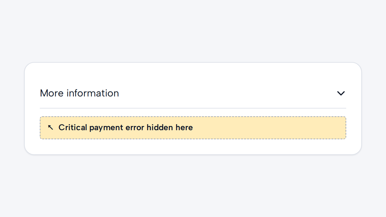
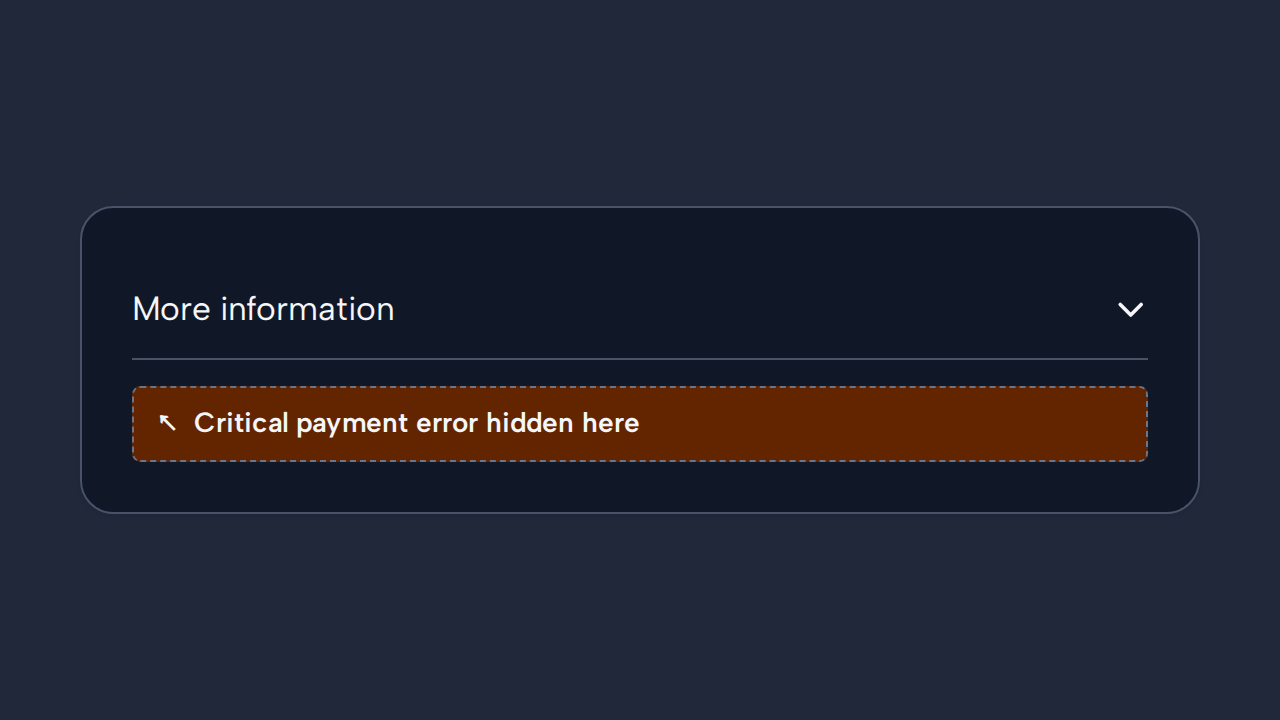
Keep primary actions and critical errors outside collapsed items where people could overlook them.
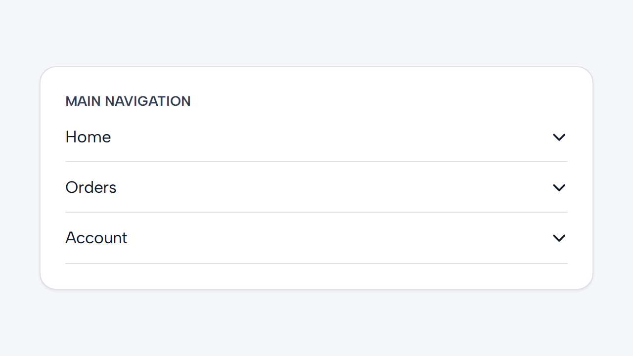
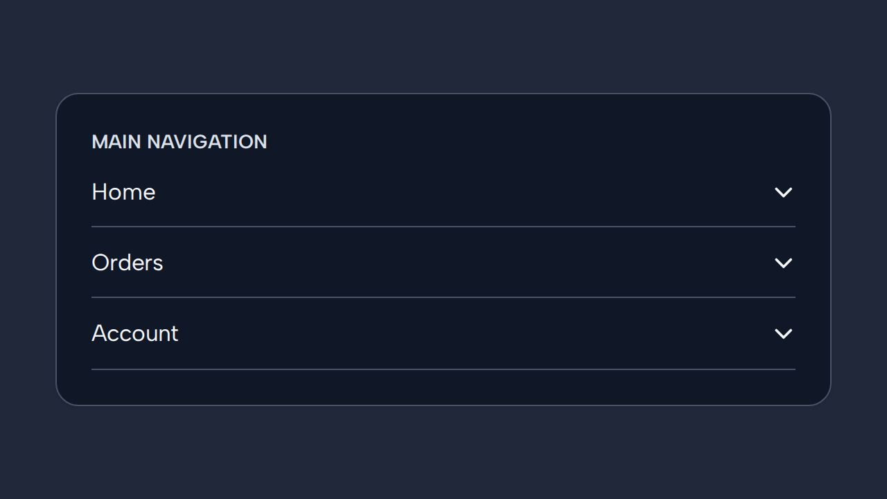
Use links or Tabs when the destinations do not form sections of one related disclosure.