

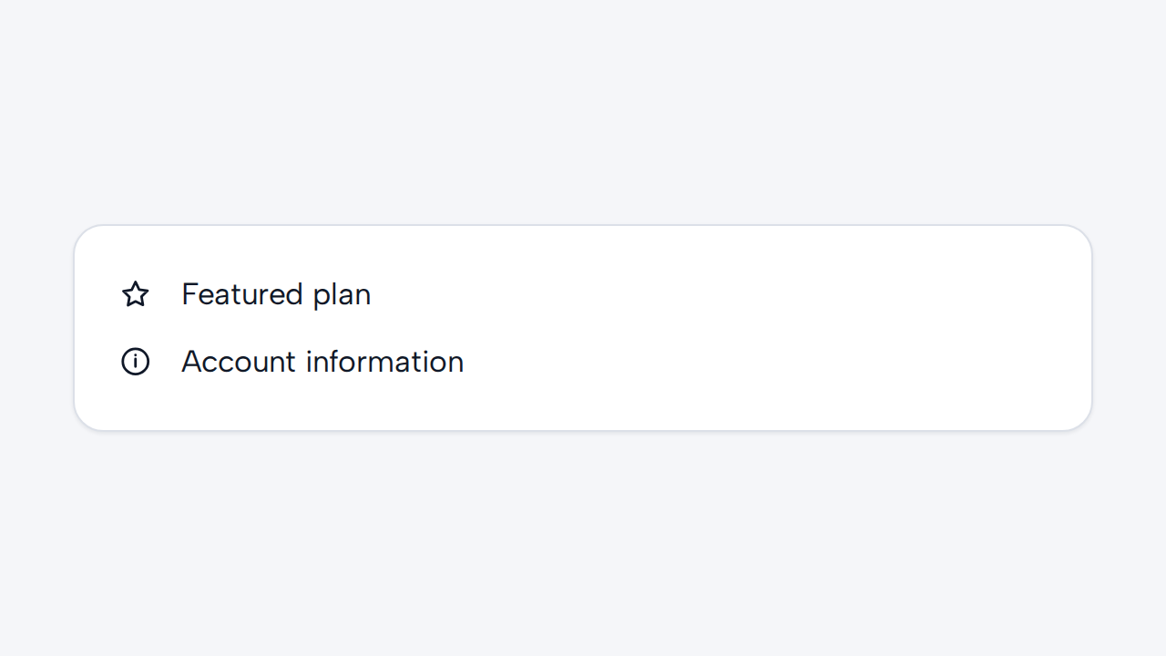

Do
Label only meaningful icons
Leave decorative icons hidden from assistive technology and provide a label when an icon conveys meaning on its own.
aidsgn-icon renders a small built-in SVG synchronously and inherits the surrounding text color and size. It is decorative by default.
<aidsgn-icon name="check"><svg class="aidsgn-icon__svg" viewBox="0 0 24 24" aria-hidden="true"><path d="M5 12l4 4L19 6"></path></svg></aidsgn-icon>Leave label unset when nearby text or the containing control already supplies the meaning. For the uncommon standalone meaningful icon, provide a concise label:
<aidsgn-icon name="warning" label="Warning"> <svg class="aidsgn-icon__svg" viewBox="0 0 24 24" aria-hidden="true"> <path d="M10.29 3.86 1.82 18a2 2 0 0 0 1.71 3h16.94a2 2 0 0 0 1.71-3L13.71 3.86a2 2 0 0 0-3.42 0ZM12 9v4M12 17h.01" ></path> </svg></aidsgn-icon>The default size is 1em. Change font-size on the host for text-relative sizing, or set --aidsgn-icon-size for an explicit local override. For large product-specific sets, multicolor artwork, or critical graphics that must appear before custom elements upgrade, use an authored SVG or image asset instead.
Leave decorative icons hidden from assistive technology and provide a label when an icon conveys meaning on its own.
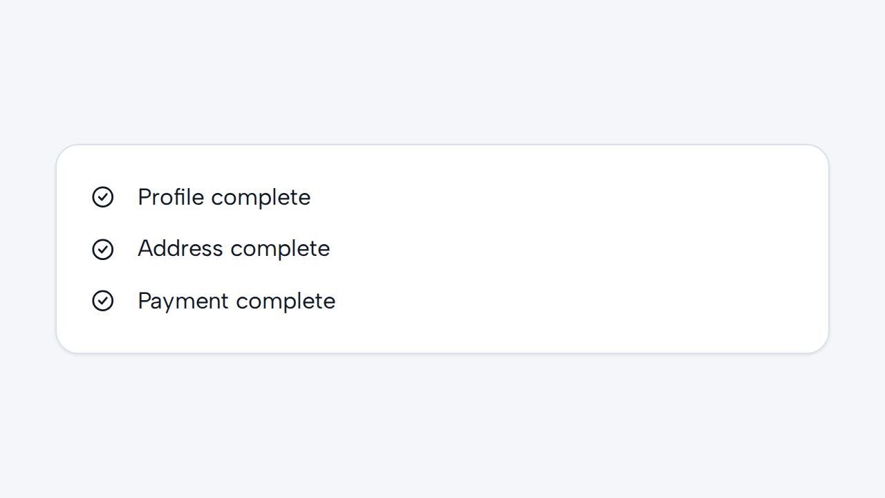

Reuse familiar symbols for the same concepts so people can learn their meaning across the product.
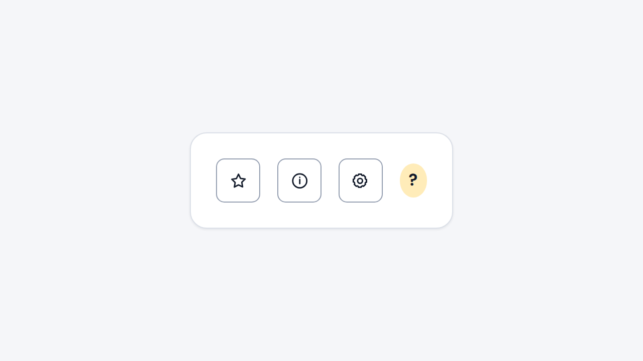
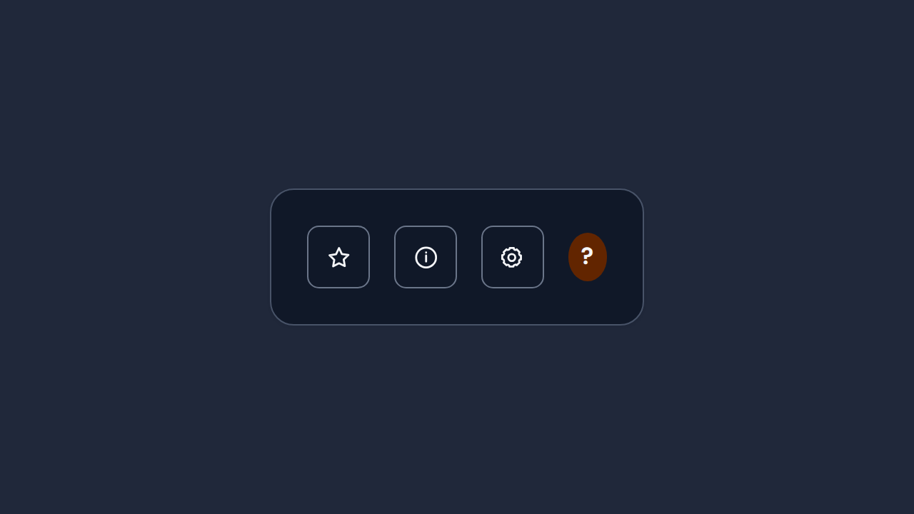
Pair an unfamiliar symbol with visible text and always give a meaningful control an accessible name.
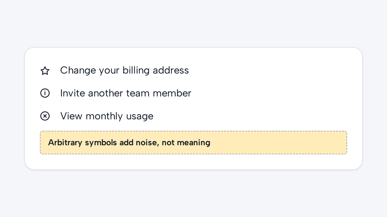
Do not change meaning through color alone or add decorative icons that make dense copy harder to scan.