

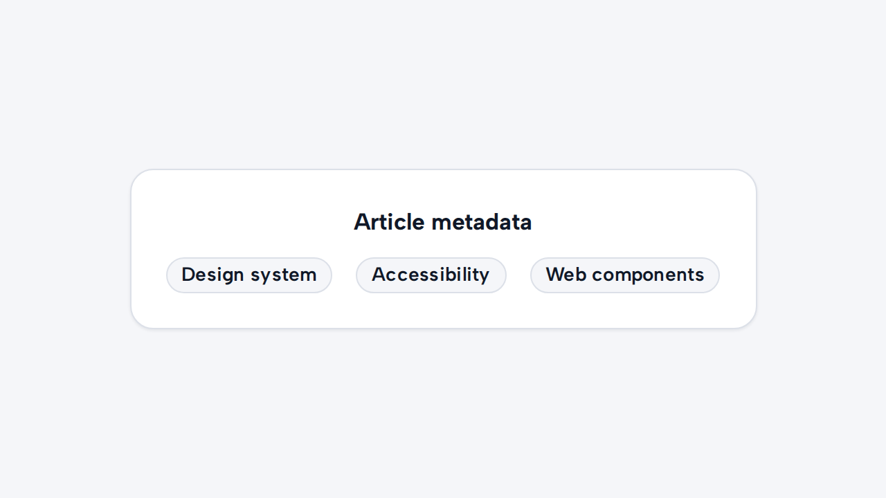
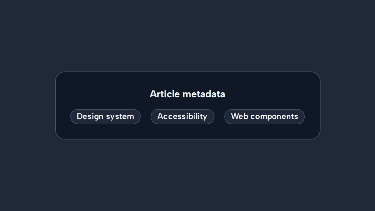
Do
Present concise metadata
Use Tag for short, passive categories, attributes, or status text.
aidsgn-tag displays compact metadata, categories, or a short status. It remains a light-DOM host with the aidsgn-tag class, making plain text and inline icons easy to inspect and theme.
<aidsgn-tag>New release</aidsgn-tag>Use neutral tags for general metadata, accent for noteworthy but non-critical information, and success, warning, or error only alongside meaningful text.
<aidsgn-tag>Design</aidsgn-tag><aidsgn-tag variant="accent">New</aidsgn-tag><aidsgn-tag variant="success">Published</aidsgn-tag><aidsgn-tag variant="warning">Action needed</aidsgn-tag><aidsgn-tag variant="error">Failed</aidsgn-tag>Keep labels short. Do not use color as the only status signal. A tag is passive by default; the future removable form will provide an explicit native remove button rather than making the whole tag ambiguously clickable.
Use Tag for short, passive categories, attributes, or status text.
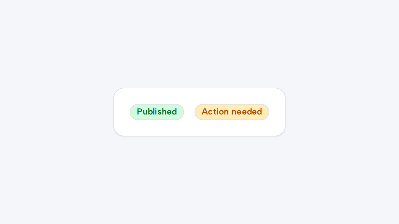

Choose a status variant only when its meaning truthfully describes the tagged content.
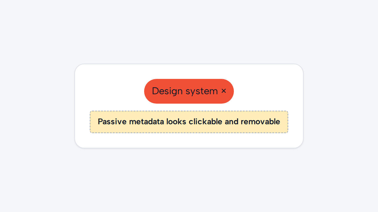
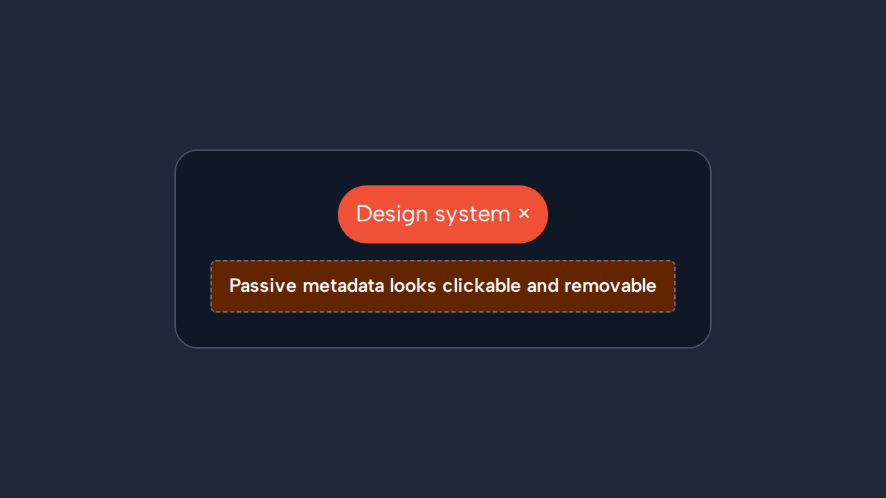
Do not make the current Tag clickable or removable because it has no interactive contract.
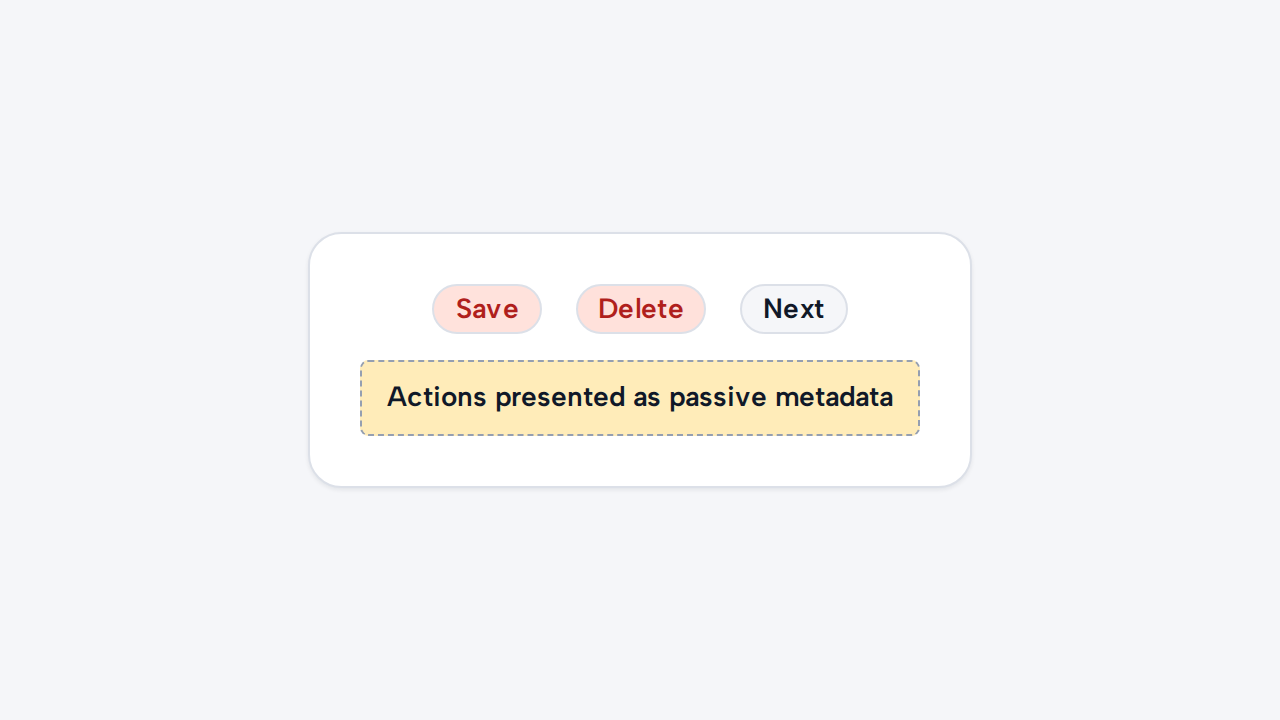

Use Button, Link, or an appropriate form control when people need to act or edit.