

Do
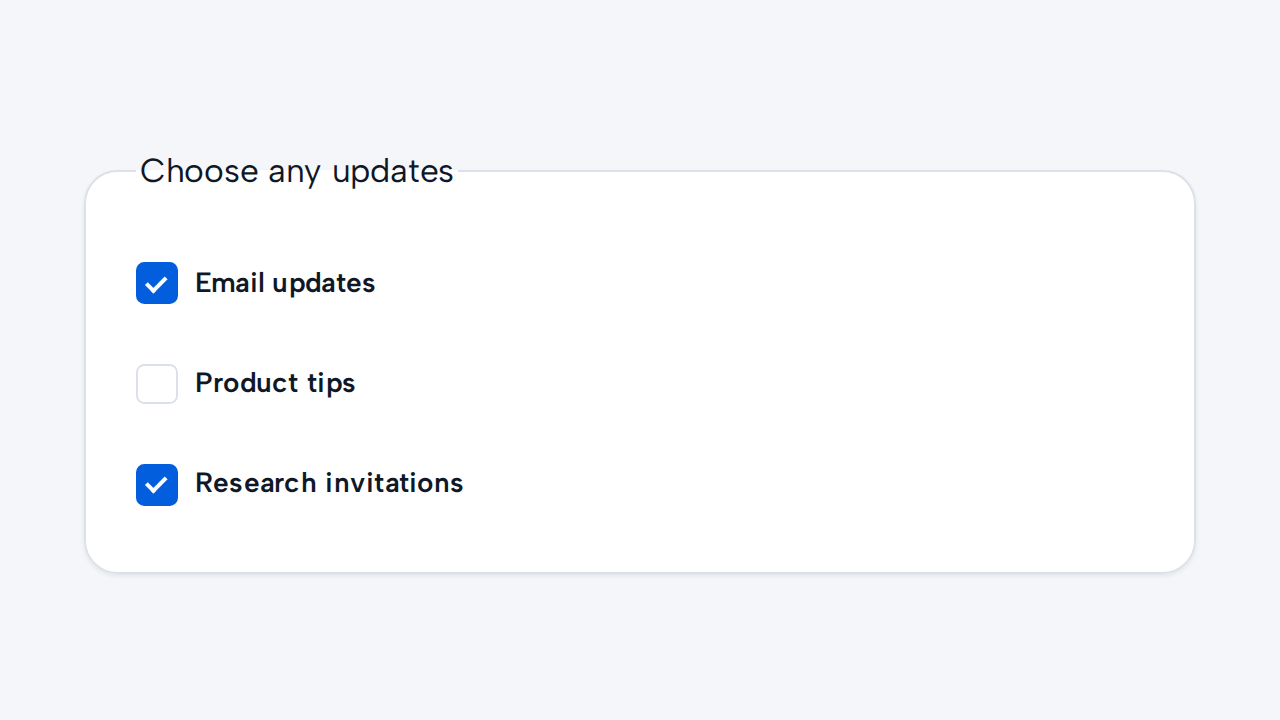
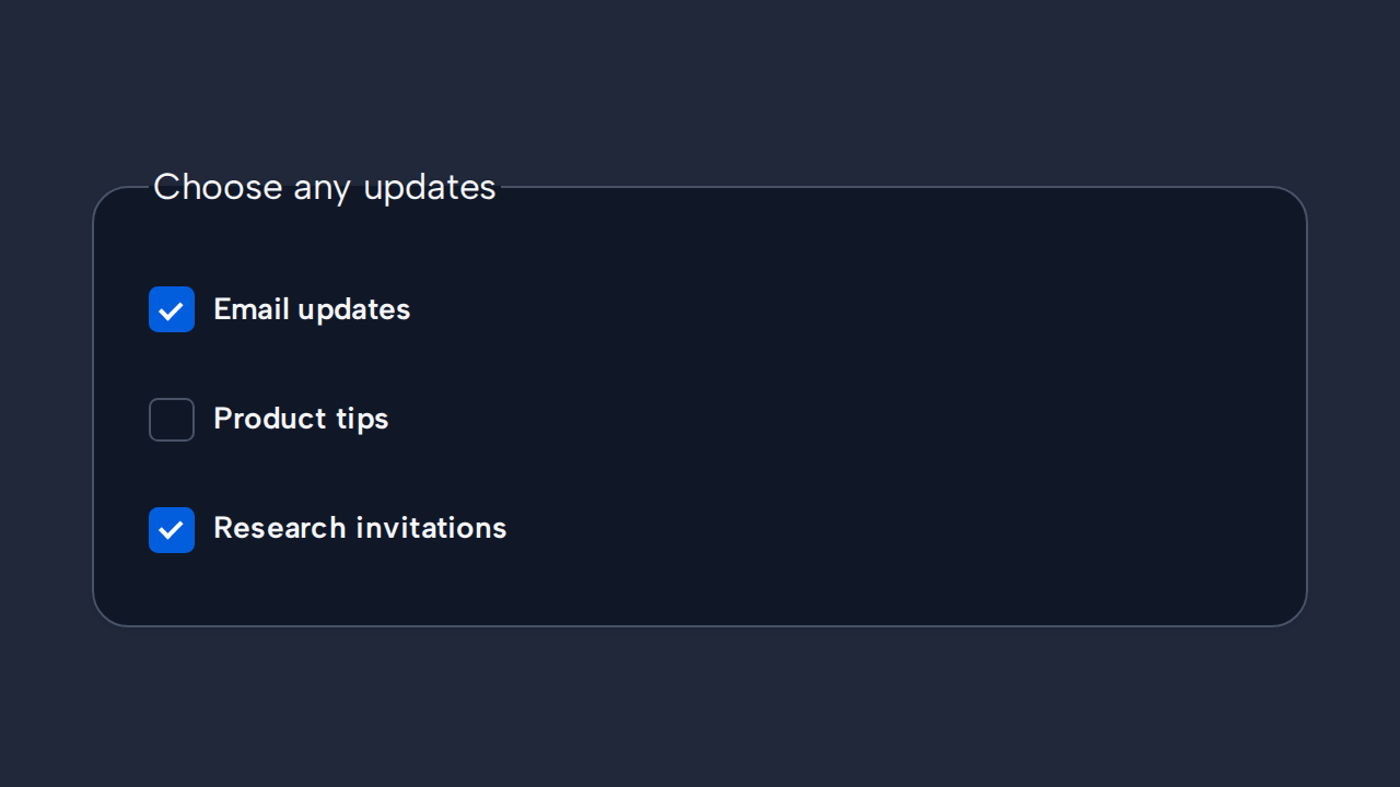
Use Checkbox for independent choices
Let people select zero, one, or many options when each choice stands on its own.
aidsgn-checkbox places a visually hidden native checkbox inside its visible native label. The custom box and checkmark provide consistent theme styling while the input keeps native keyboard, form, validation, and change behavior. Use the label attribute (and optional input-id) to supply its accessible, clickable label. checked, disabled, and required configure the native input, and their matching properties read or change its state.
Its default visible indicator is 20×20px, inside a content-bound target with a 36px minimum block size. Both dimensions scale with the root text size; there are no public size variants.
<aidsgn-checkbox label="Send me product updates" input-id="updates" name="updates" value="yes"> <label class="aidsgn-checkbox__label"> <input class="aidsgn-checkbox__input" id="updates" type="checkbox" name="updates" value="yes" aria-invalid="false"> <span class="aidsgn-checkbox__control" aria-hidden="true"></span> <span class="aidsgn-checkbox__text">Send me product updates</span> </label> <p class="aidsgn-field-message aidsgn-field-message--helper" hidden> </p> <p class="aidsgn-field-message aidsgn-field-message--error" aria-live="polite" hidden> </p></aidsgn-checkbox>
<aidsgn-checkbox checked label="Send me product updates" input-id="checked-updates" name="updates" value="yes"> <label class="aidsgn-checkbox__label"> <input class="aidsgn-checkbox__input" id="checked-updates" type="checkbox" name="updates" value="yes" checked aria-invalid="false"> <span class="aidsgn-checkbox__control" aria-hidden="true"></span> <span class="aidsgn-checkbox__text">Send me product updates</span> </label> <p class="aidsgn-field-message aidsgn-field-message--helper" hidden> </p> <p class="aidsgn-field-message aidsgn-field-message--error" aria-live="polite" hidden> </p></aidsgn-checkbox>Use it for independent multi-select choices. Author the native input and label inside the host; clicking the label toggles the input, and keyboard focus produces a visible ring around the custom box. When name is set, the native descendant participates in the surrounding form. helper-text adds guidance; error-message renders an associated error and implies invalid state. Use invalid for an invalid state without error text. Indeterminate is not implemented.
The host fills the width assigned by its parent while the label target remains content-bound. Helper and error messages occupy separate inert rows and default to a 65ch maximum measure through --aidsgn-field-message-max-inline-size. Give each host an explicit layout cell when arranging Selection controls horizontally.
Holding an enabled Checkbox compresses its visible box without changing the target. This Press feedback is separate from the persistent checked treatment, and reduced motion suppresses both press and selection animation.
Let people select zero, one, or many options when each choice stands on its own.
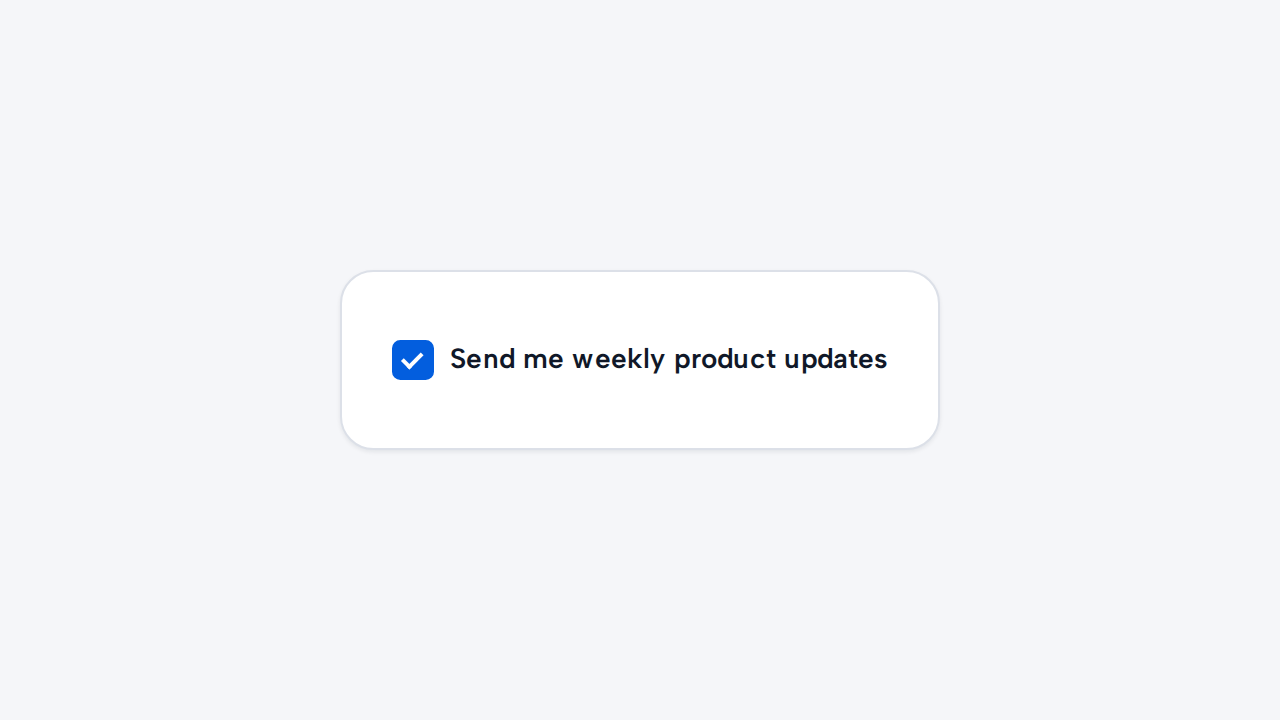
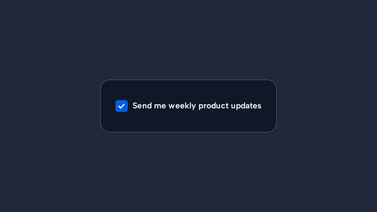
A positive visible label makes the meaning of both checked and unchecked states easier to understand.
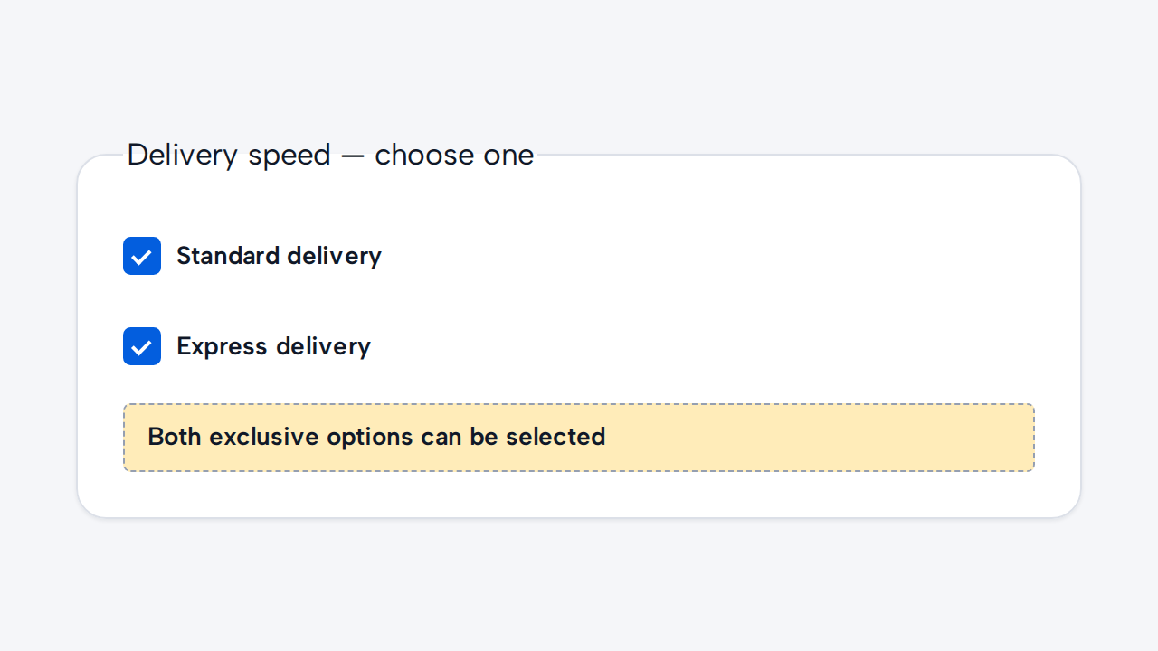
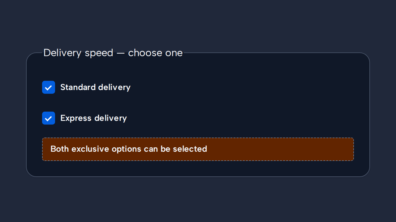
Use Radio when choosing one option must deselect the others.
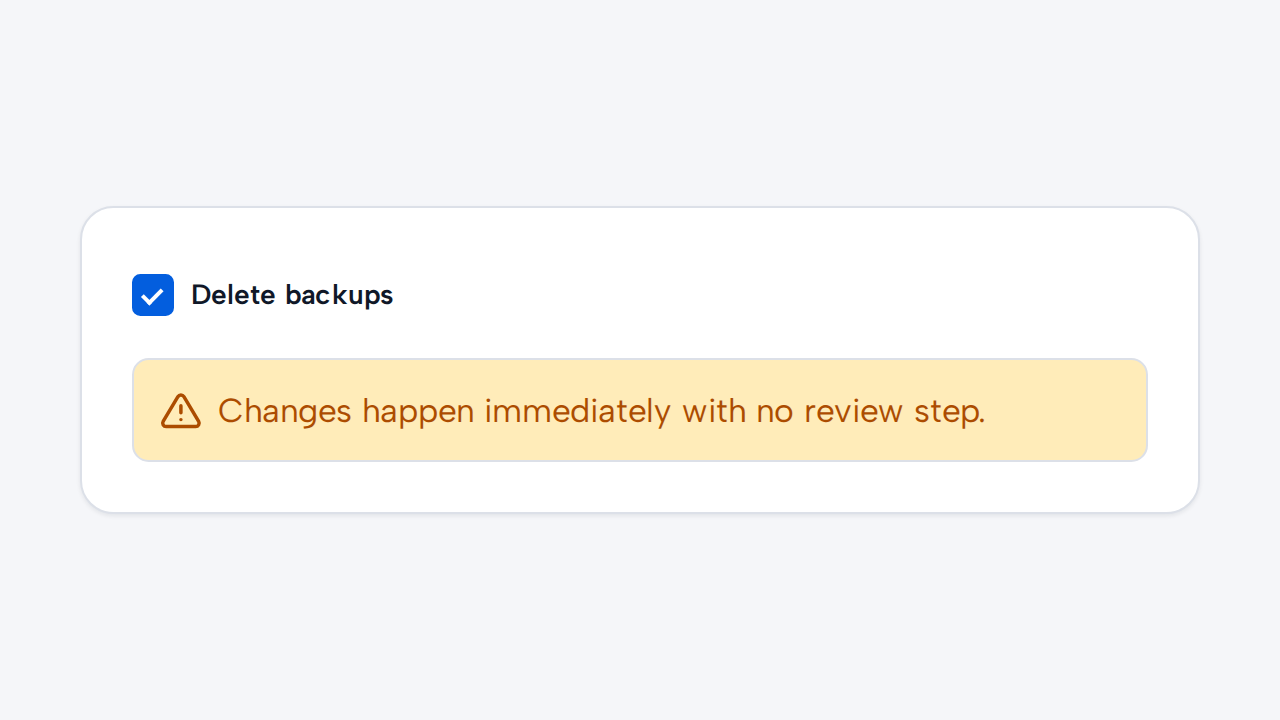
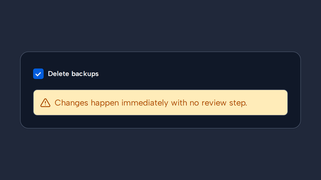
Use Switch when changing the value takes effect immediately instead of being reviewed and submitted later.