

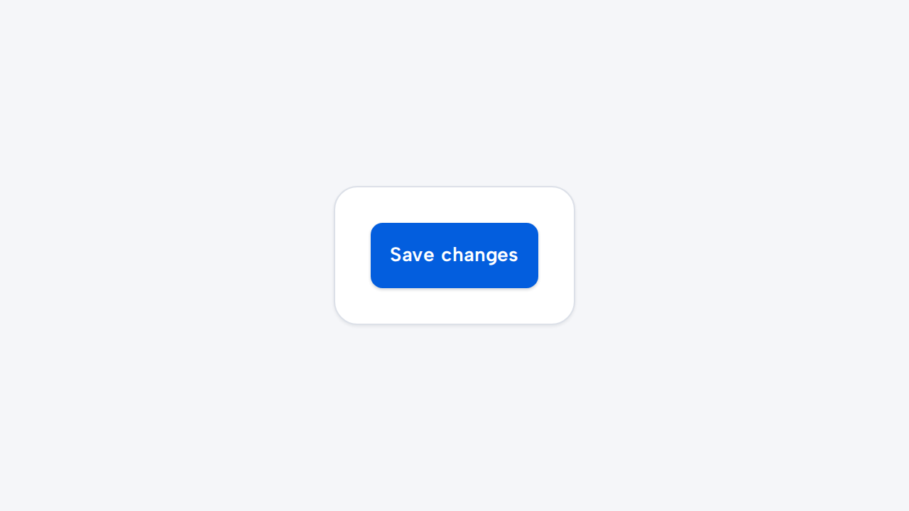
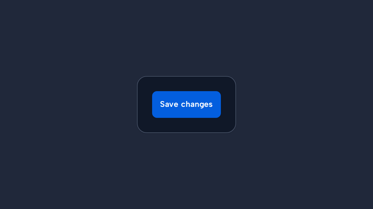
Do
Describe the action’s result
Use a verb-led label so people can predict what activating the Button will do.
aidsgn-button triggers an immediate action. It is not a navigation control; use an anchor for destinations.
<aidsgn-button><button class="aidsgn-button aidsgn-button--primary aidsgn-button--medium" type="button"><span class="aidsgn-button__label">Continue</span><span class="aidsgn-button__spinner" role="status" aria-label="Loading" hidden></span></button></aidsgn-button>The component uses light DOM. Author a native <button class="aidsgn-button"> inside the host; it retains platform keyboard and disabled behavior. Import @aidsgn/components/styles.css once together with the generated token CSS.
<aidsgn-button disabled><button class="aidsgn-button aidsgn-button--primary aidsgn-button--medium" type="button" disabled><span class="aidsgn-button__label">Continue</span><span class="aidsgn-button__spinner" role="status" aria-label="Loading" hidden></span></button></aidsgn-button>Use primary for the single dominant action, secondary for a supporting action, and tertiary for a low-emphasis action that remains a button rather than navigation.
Secondary and tertiary buttons use a restrained action tint on hover, with text colors selected for the active light or dark theme.
<aidsgn-button variant="primary"><button class="aidsgn-button aidsgn-button--primary aidsgn-button--medium" type="button"><span class="aidsgn-button__label">Continue</span><span class="aidsgn-button__spinner" role="status" aria-label="Loading" hidden></span></button></aidsgn-button><aidsgn-button variant="secondary"><button class="aidsgn-button aidsgn-button--secondary aidsgn-button--medium" type="button"><span class="aidsgn-button__label">Save draft</span><span class="aidsgn-button__spinner" role="status" aria-label="Loading" hidden></span></button></aidsgn-button><aidsgn-button variant="tertiary"><button class="aidsgn-button aidsgn-button--tertiary aidsgn-button--medium" type="button"><span class="aidsgn-button__label">Learn more</span><span class="aidsgn-button__spinner" role="status" aria-label="Loading" hidden></span></button></aidsgn-button>Use the default medium size for primary task controls. Use small for dense supporting actions while preserving spacing between adjacent targets.
<aidsgn-button size="medium"><button class="aidsgn-button aidsgn-button--primary aidsgn-button--medium" type="button"><span class="aidsgn-button__label">Continue</span><span class="aidsgn-button__spinner" role="status" aria-label="Loading" hidden></span></button></aidsgn-button><aidsgn-button size="small" variant="secondary"><button class="aidsgn-button aidsgn-button--secondary aidsgn-button--small" type="button"><span class="aidsgn-button__label">Add item</span><span class="aidsgn-button__spinner" role="status" aria-label="Loading" hidden></span></button></aidsgn-button>Use a text label or aria-label, keep the target at least 44px high, and use disabled for unavailable actions. loading disables the control, sets aria-busy, and replaces its label with an accessible spinner. type="submit" passes through to the native button. Holding an enabled button applies shared Press feedback without changing its target geometry, while variant-specific active colors remain intact. Reduced motion suppresses the scale and spinner rotation.
Use a verb-led label so people can predict what activating the Button will do.
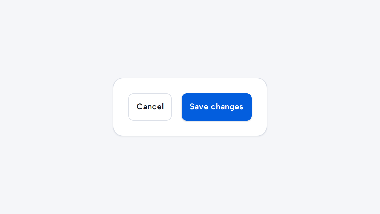
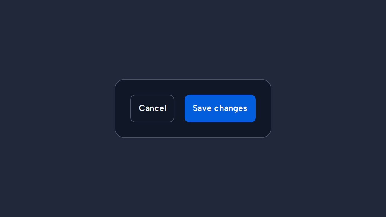
Use the primary variant only for the most important action in a region, so the visual hierarchy remains clear.
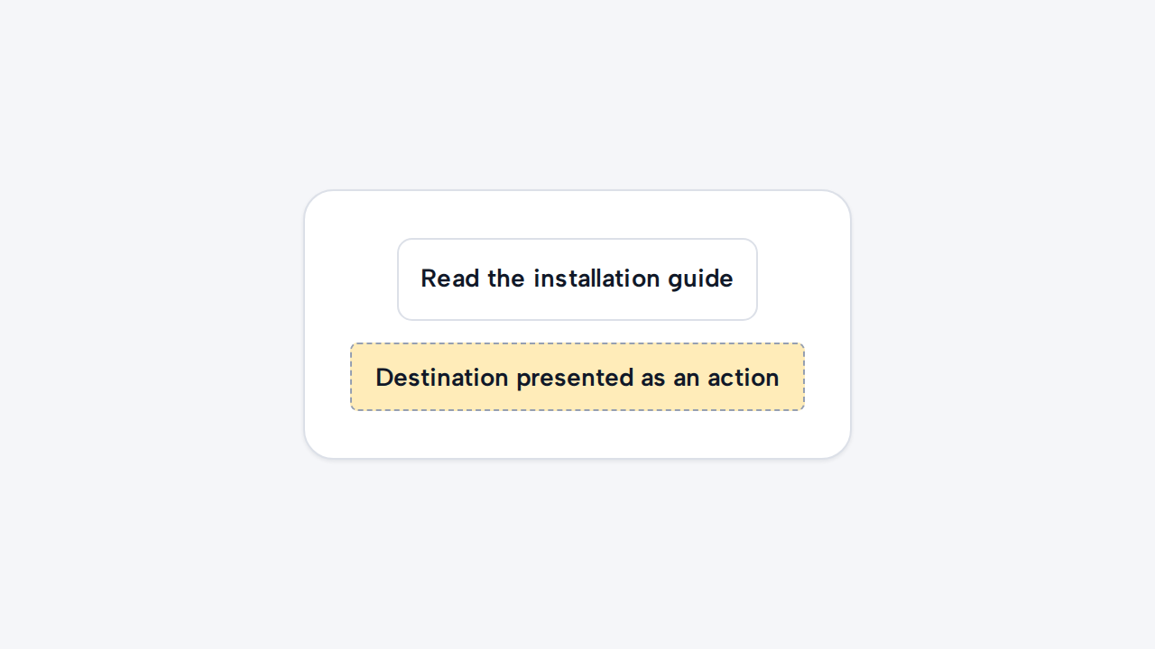
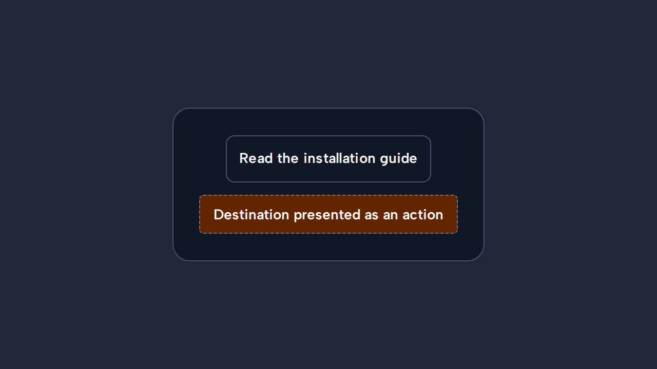
Use Link when activation changes location, preserving the expected navigation semantics and browser behavior.
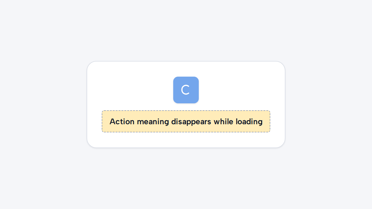
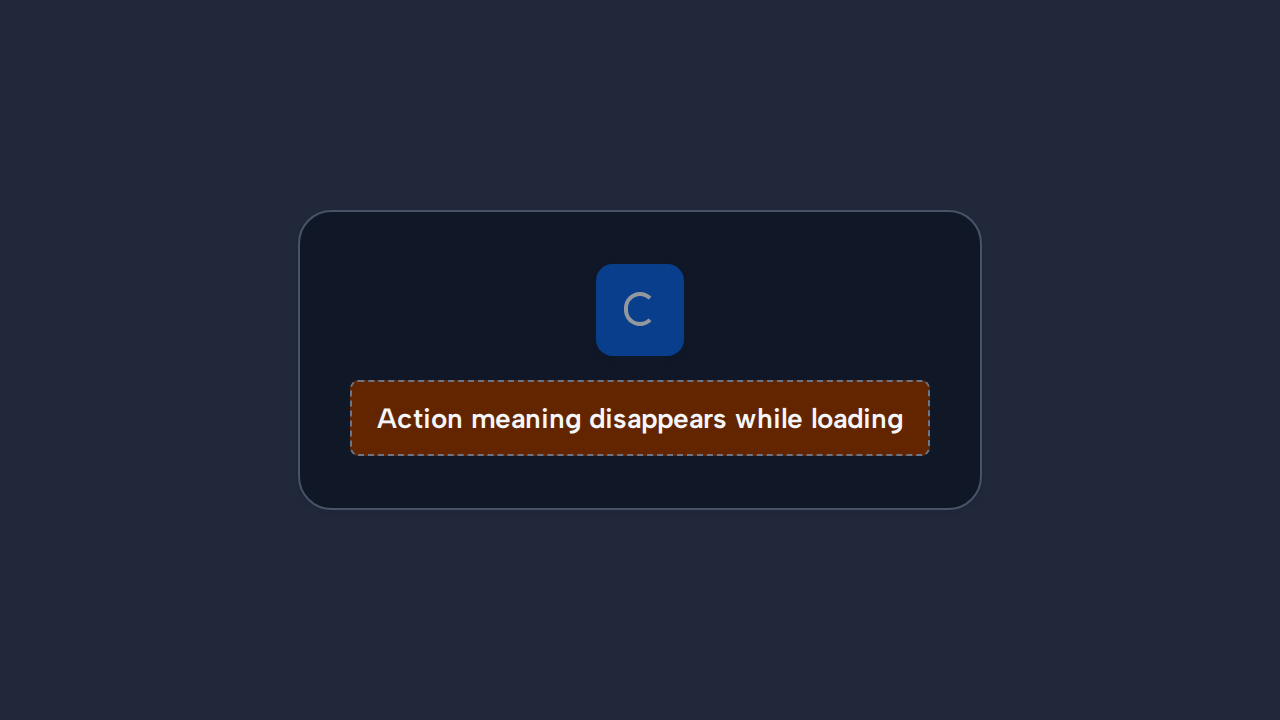
Preserve an understandable accessible label while the spinner replaces the visible Button text.