

Do
Keep the label visible
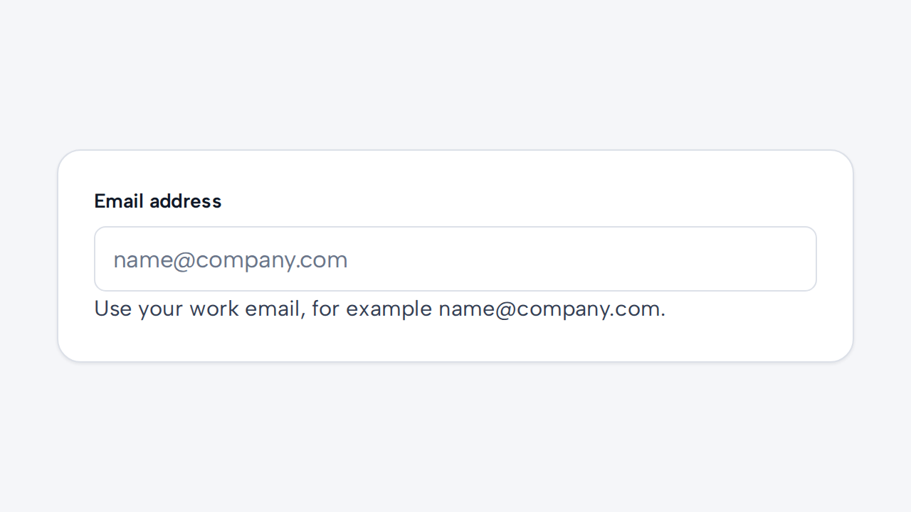
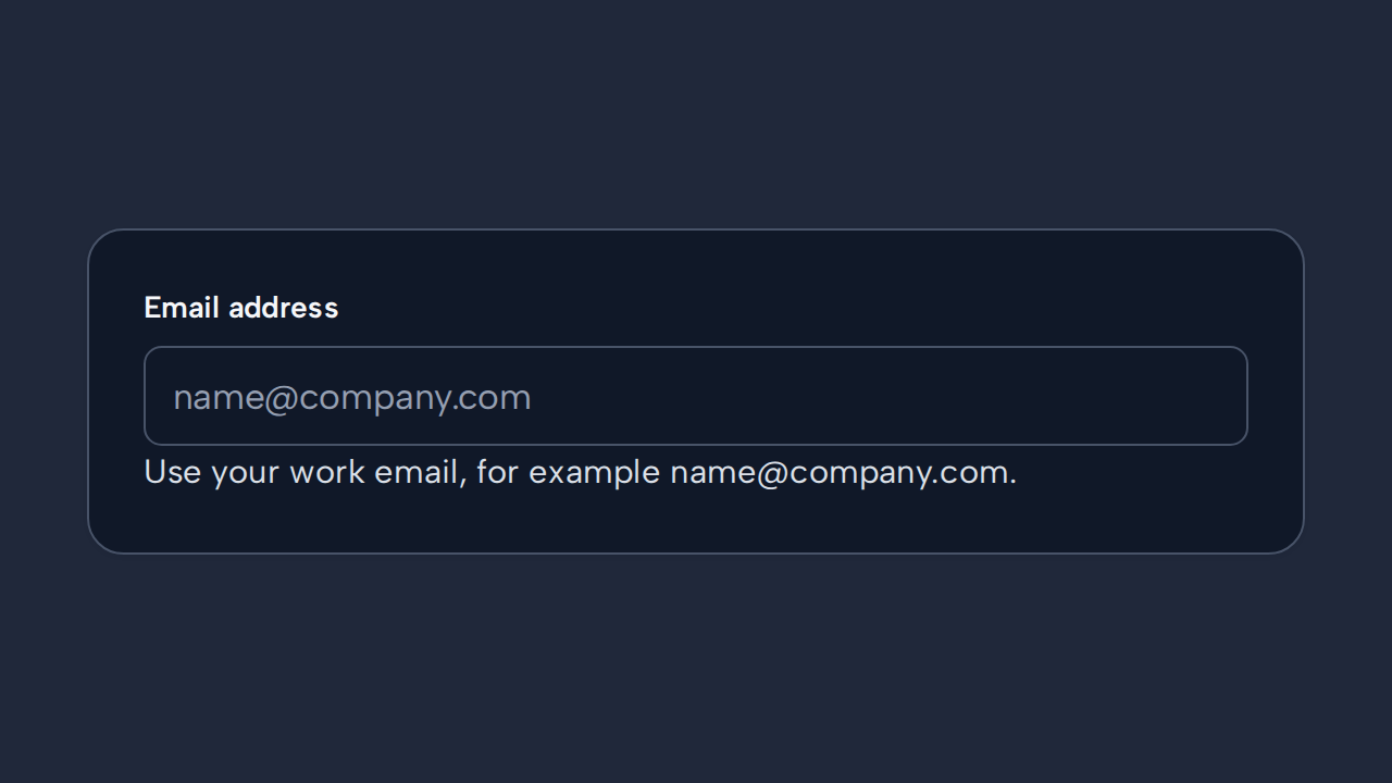
Add helper text when the expected format or purpose is not obvious, while keeping a persistent visible label.
aidsgn-input is a single-line native control for text, email, datetime-local, date, time, password, search, tel, and url. Its label attribute creates a visible native label linked to the input in light DOM, so application selectors, browser tooling, validation, and native input behavior all remain available. The field fills its parent’s available width by default; constrain or arrange the host from the parent layout.
Use helper-text for guidance. Set error-message to show and programmatically associate an error; it implies an invalid state. Use invalid when the field must be marked invalid without visible error text. Field messages wrap within the available width and default to a 65ch maximum measure; customize it with --aidsgn-field-message-max-inline-size.
<aidsgn-input label="Email address" input-id="email" type="email" name="email" placeholder="name@example.com" required> <label class="aidsgn-input__label aidsgn-is-required" for="email">Email address</label> <input class="aidsgn-input" id="email" type="email" name="email" placeholder="name@example.com" required aria-invalid="false"> <p class="aidsgn-field-message aidsgn-field-message--helper" hidden> </p> <p class="aidsgn-field-message aidsgn-field-message--error" aria-live="polite" hidden> </p></aidsgn-input>
<aidsgn-input label="Account email" input-id="account-email" disabled placeholder="Unavailable"> <label class="aidsgn-input__label" for="account-email">Account email</label> <input class="aidsgn-input" id="account-email" type="text" placeholder="Unavailable" disabled aria-invalid="false"> <p class="aidsgn-field-message aidsgn-field-message--helper" hidden> </p> <p class="aidsgn-field-message aidsgn-field-message--error" aria-live="polite" hidden> </p></aidsgn-input>Use label for every field; a placeholder is a hint, never a label. The current API supports label, input-id, type, placeholder, name, autocomplete, inputmode, disabled, required, readonly, and the value property. Disabled and readonly fields use a muted surface, while disabled fields also use a not-allowed cursor.
Use the native type instead of a dedicated DateField, EmailField, PasswordField, or SearchField when the only difference is <input type>. Dedicated components are reserved for controls with additional composed behavior and accessibility requirements. Use Select for predefined options.
Add helper text when the expected format or purpose is not obvious, while keeping a persistent visible label.
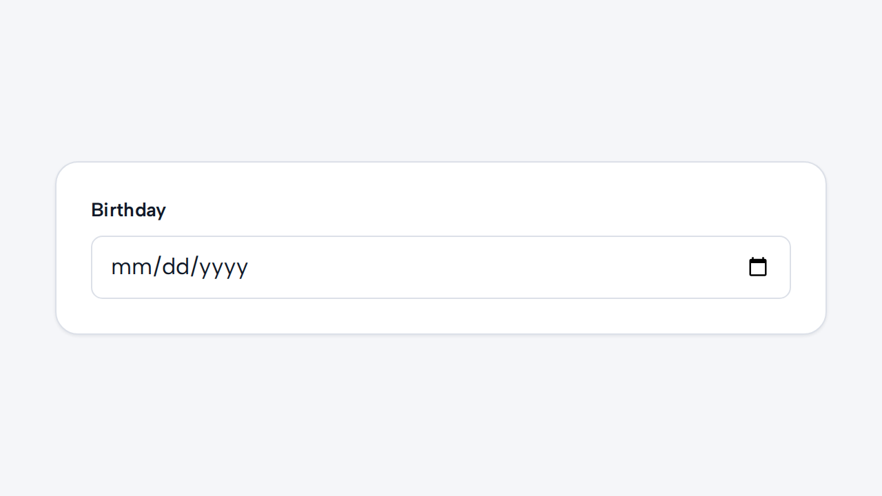
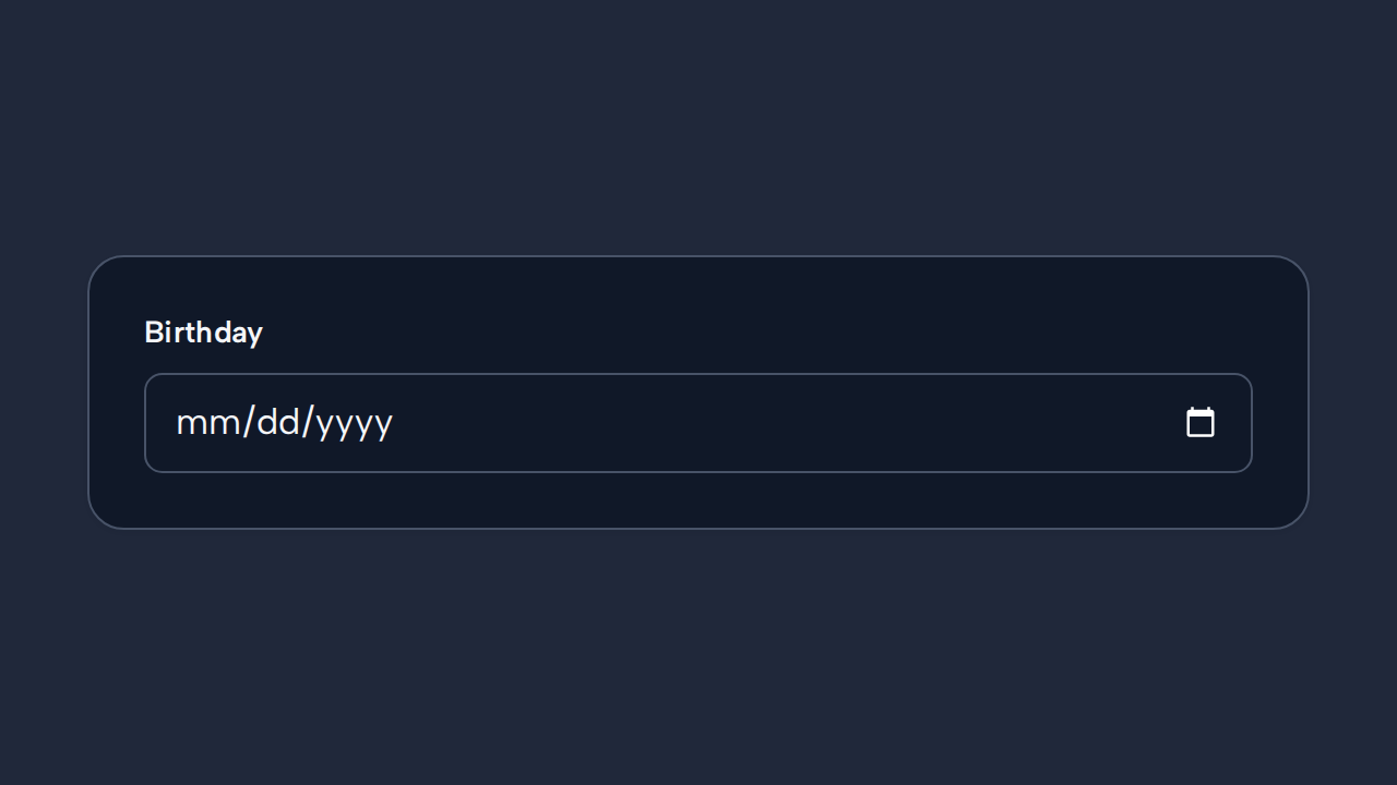
Choose the native input type and autocomplete value that give people the appropriate browser controls and autofill behavior.
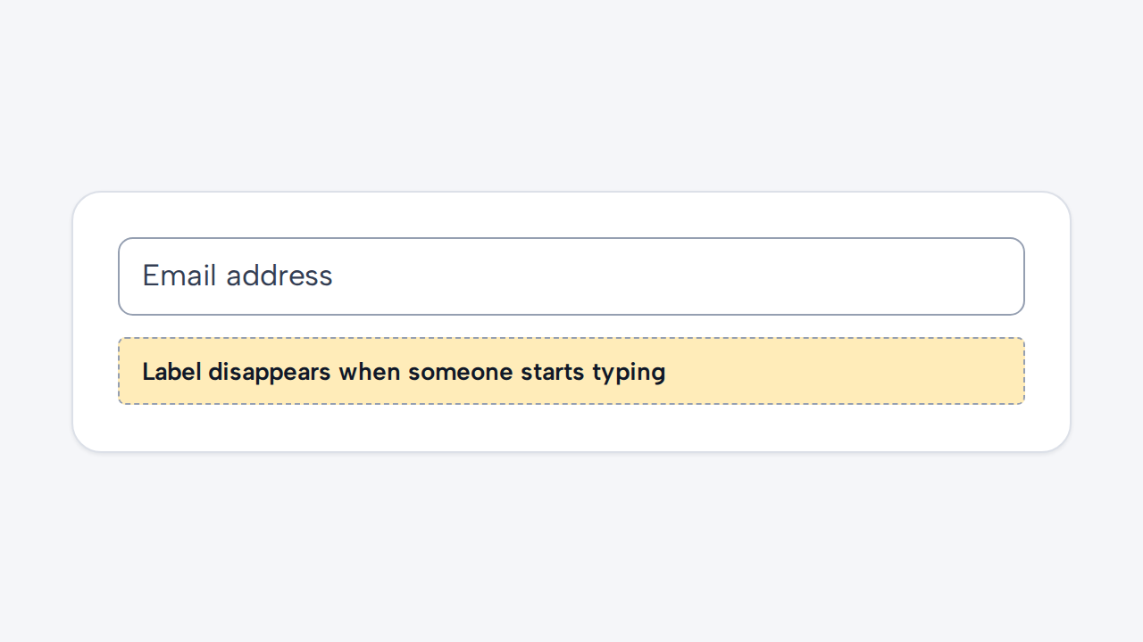
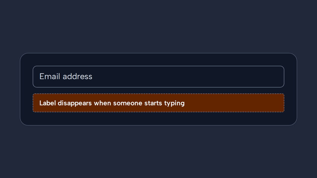
Placeholder text disappears during entry and does not replace a persistent, programmatically associated label.
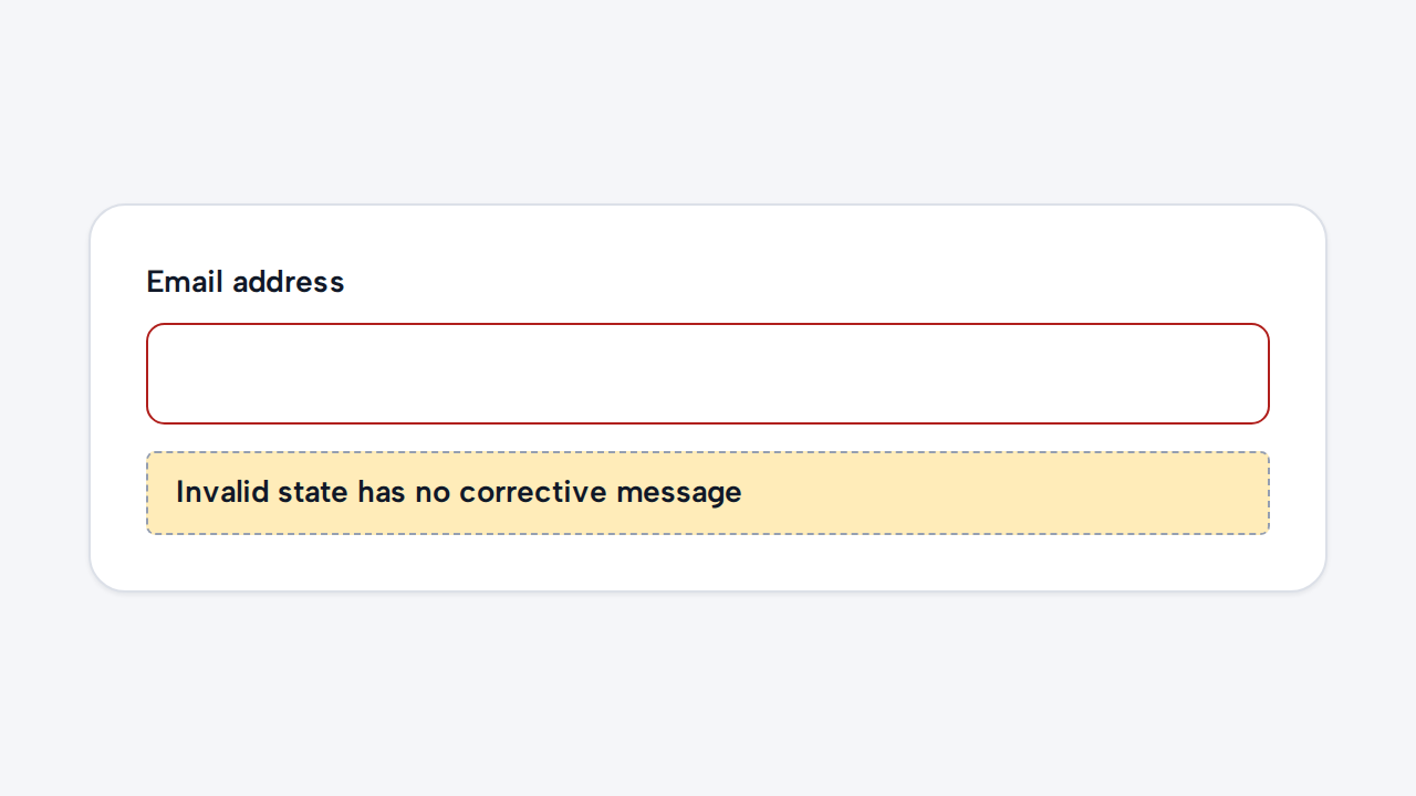
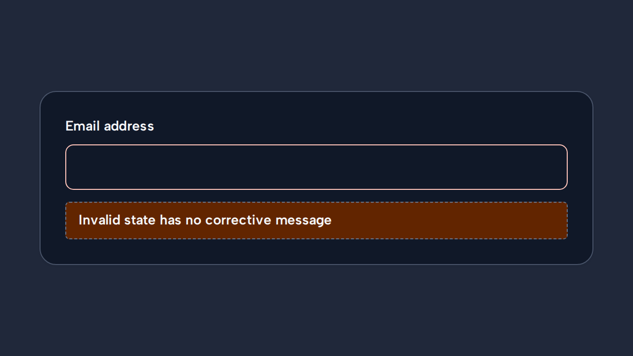
Tell people what went wrong and how to correct it instead of relying on an invalid state alone.