

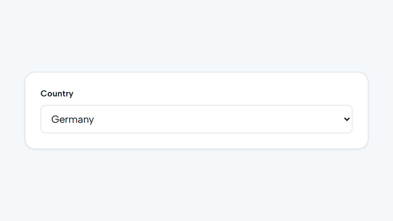

Do
Offer a compact, familiar choice
Use Select when people can recognize the options without comparing rich details side by side.
aidsgn-select wraps authored options in a labelled native select. Clicking its visible label focuses the control. The platform continues to own keyboard interaction, validation, selection, and form submission, while the component supplies the shared field layout and visual treatment.
Use helper-text for selection guidance. error-message renders an associated error and implies invalid state; invalid marks the native select with aria-invalid without requiring a message. Field messages wrap within the available width and default to a 65ch maximum measure; customize it with --aidsgn-field-message-max-inline-size.
<aidsgn-select label="Design discipline" select-id="discipline" name="discipline" required> <label class="aidsgn-select__label aidsgn-is-required" for="discipline">Design discipline</label> <select class="aidsgn-select" id="discipline" name="discipline" required aria-invalid="false"> <option value="">Choose a discipline</option> <option value="product">Product design</option> <option value="content">Content design</option> <option value="research">User research</option> </select> <p class="aidsgn-field-message aidsgn-field-message--helper" hidden> </p> <p class="aidsgn-field-message aidsgn-field-message--error" aria-live="polite" hidden> </p></aidsgn-select>Use multiple for native multiple selection and pair it with a useful size. The authored options remain in light DOM. Parent layout controls the field width; the host fills the available inline size by default.
Use Select when people can recognize the options without comparing rich details side by side.
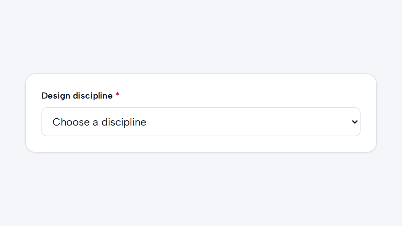

Provide a visible label and include a prompt option when no default selection is appropriate.
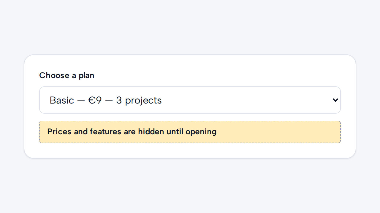
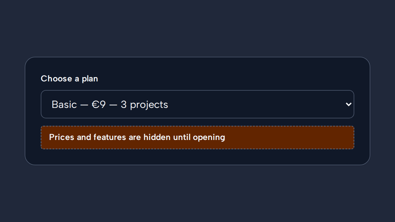
Present detailed options visibly when people need to compare their content before choosing.
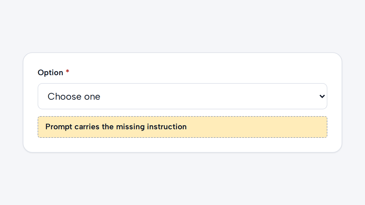
Keep required validation and helpful labeling explicit instead of treating the prompt option as their replacement.