

Do
Create one named choice group
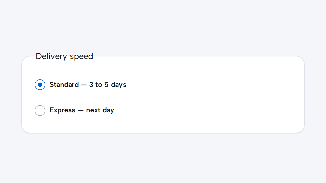
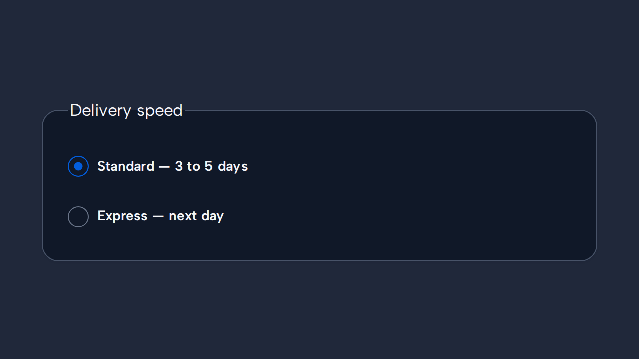
Give related Radios the same name and a visible group label when people must select one option.
aidsgn-radio is a native radio with a linked light-DOM label. Options that belong to one decision share a name; the browser then manages their mutually exclusive selection.
Its controlled cross-browser appearance keeps the native input and form behavior. The default visible indicator is 20×20px, inside a content-bound target with a 36px minimum block size. Both dimensions scale with the root text size; there are no public size variants.
Use helper-text for option guidance. error-message renders an associated error and implies invalid state; invalid marks the native radio with aria-invalid without requiring a message. Helper and error messages occupy separate inert rows and default to a 65ch maximum measure through --aidsgn-field-message-max-inline-size.
<aidsgn-radio name="plan" value="starter" input-id="plan-starter" checked label="Starter"><input class="aidsgn-radio__input" id="plan-starter" type="radio" name="plan" value="starter" checked /><label class="aidsgn-radio__label" for="plan-starter">Starter</label><p class="aidsgn-field-message aidsgn-field-message--helper" hidden> </p><p class="aidsgn-field-message aidsgn-field-message--error" hidden> </p></aidsgn-radio><aidsgn-radio name="plan" value="team" input-id="plan-team" label="Team"><input class="aidsgn-radio__input" id="plan-team" type="radio" name="plan" value="team" /><label class="aidsgn-radio__label" for="plan-team">Team</label><p class="aidsgn-field-message aidsgn-field-message--helper" hidden> </p><p class="aidsgn-field-message aidsgn-field-message--error" hidden> </p></aidsgn-radio>Use Radio when exactly one option in a visible group can be chosen. Use Checkbox for independent selections and Switch for immediate on/off settings.
Radio hosts fill the width assigned by their parent while the indicator-and-label target remains content-bound. Radio groups are normally vertical, as in the example. For a horizontal group, assign each host a column or another explicit width in application layout.
Holding an enabled Radio compresses its visible control without changing the target. This Press feedback is separate from the persistent checked treatment, and reduced motion suppresses both press and selection animation.
Give related Radios the same name and a visible group label when people must select one option.
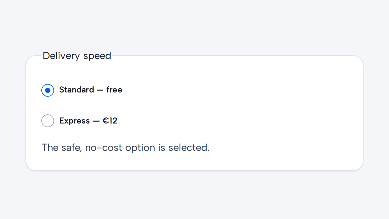
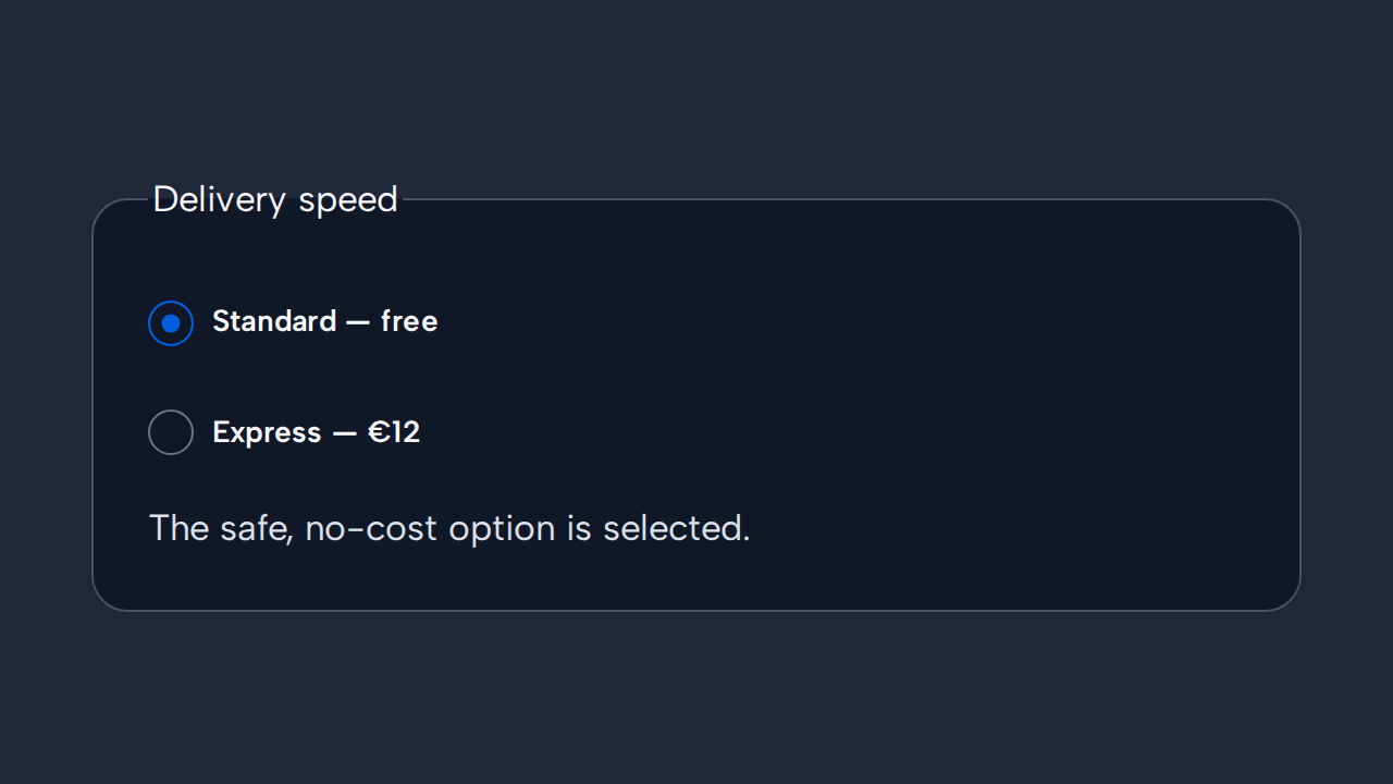
Preselect an option only when one choice is clearly safest or most common for most people.
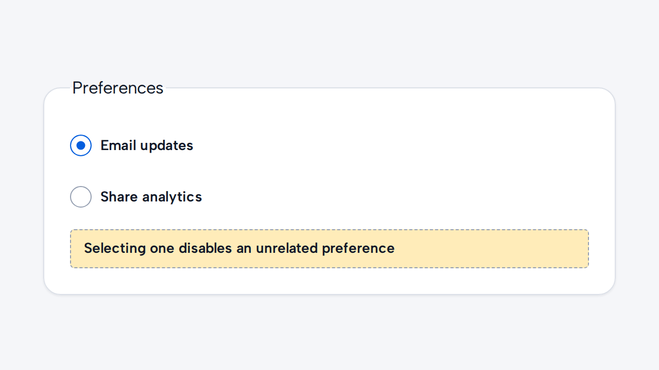
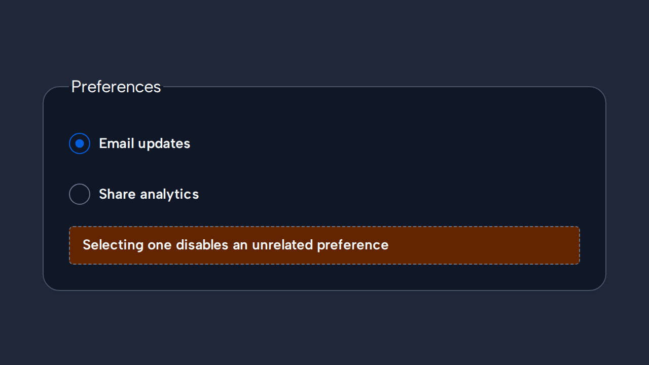
Use Checkbox when options stand alone, and do not let people deselect the only Radio choice.
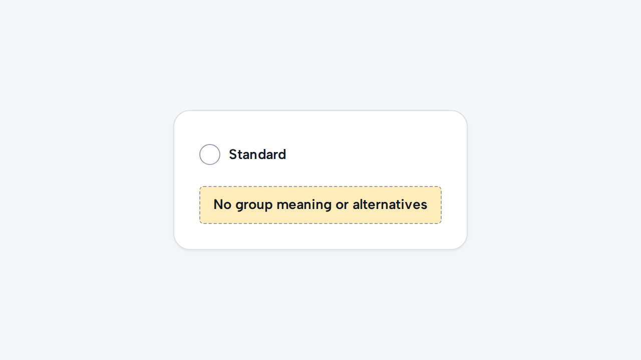
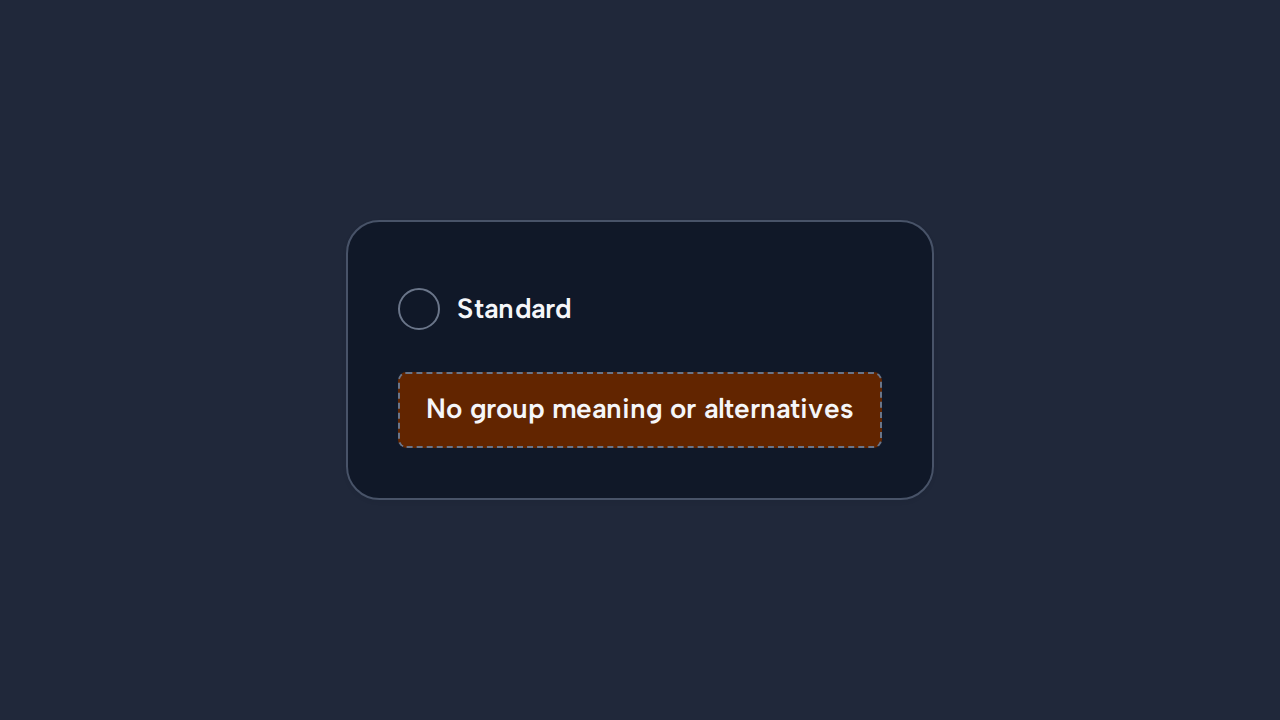
Present a Radio only as part of a choice whose alternatives and group meaning are clear.