

Do
Add brief supplementary context
Use Tooltip for a short description that appears when its control is focused or hovered.
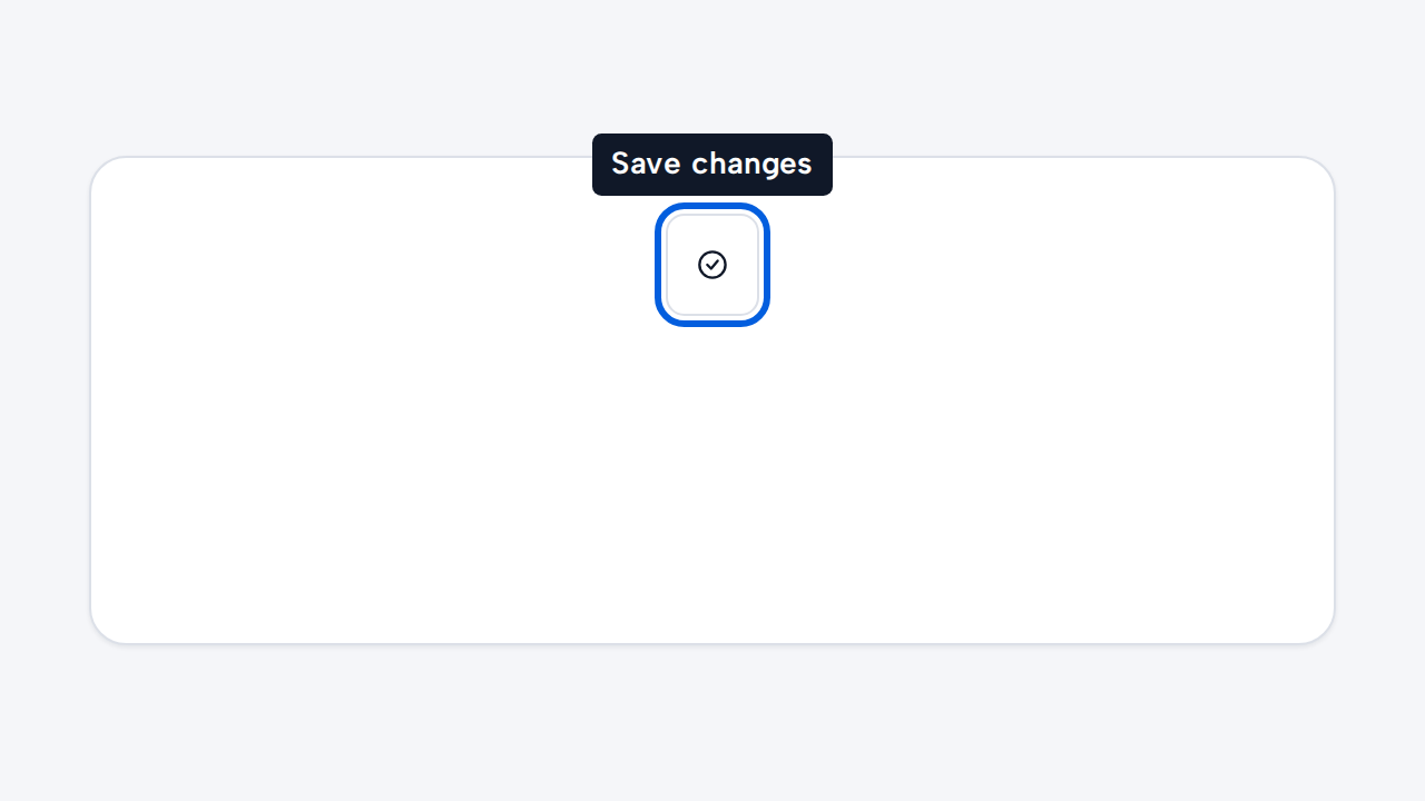
aidsgn-tooltip adds a short, non-essential description to a control. Focus or hover the trigger below; press Escape to dismiss the visible tooltip without moving focus.
Save changes
<aidsgn-tooltip placement="bottom"> <button data-aidsgn-tooltip-trigger aria-describedby="save-tooltip">Save</button> <span id="save-tooltip" role="tooltip">Save changes</span></aidsgn-tooltip>The trigger must be focusable, carry data-aidsgn-tooltip-trigger, and reference the tooltip’s unique ID through aria-describedby. Tooltip content uses role="tooltip" and must contain text only—use a disclosure or Popover pattern for interactive content.
placement accepts top, bottom, start, and end. Chrome and Safari use native CSS Anchor Positioning with opposite-side overflow fallbacks. Firefox receives a logical absolute-position fallback with the same hover, focus, Escape, RTL, and accessible-description behavior.
The component uses CSS for positioning and visibility. Its only JavaScript listens for Escape and resets dismissal when pointer or focus leaves. Customize spacing with --aidsgn-tooltip-gap and width with --aidsgn-tooltip-max-inline-size.
Reduced-motion preferences remove both the opacity transition and reveal delay, so hover and focus show the tooltip immediately.
Use Tooltip for a short description that appears when its control is focused or hovered.
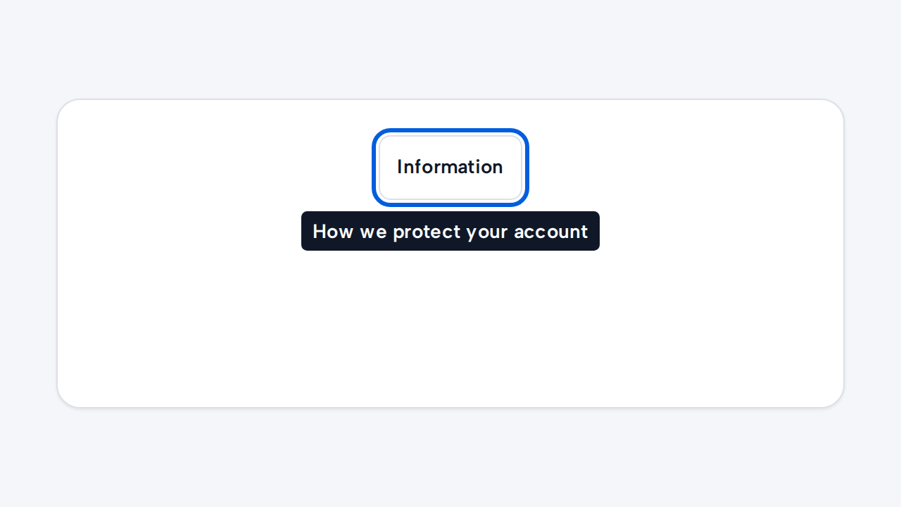
Ensure the trigger is keyboard reachable and the description remains useful but non-essential.
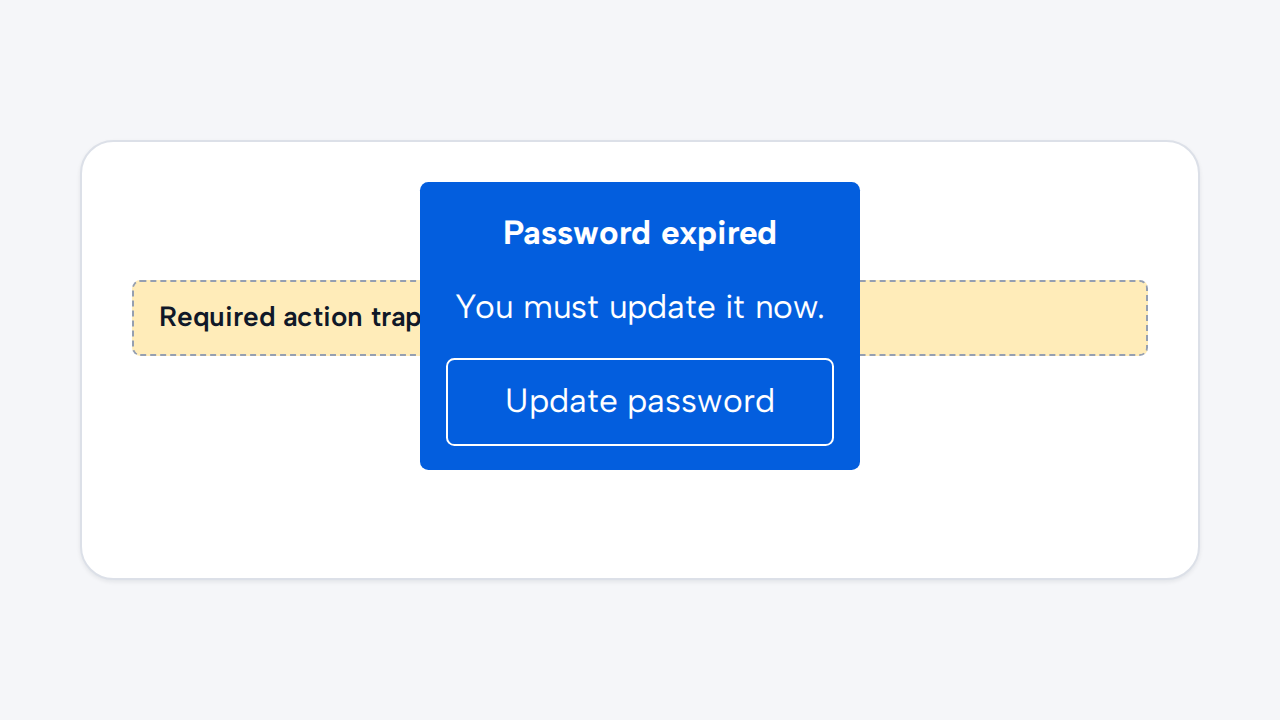
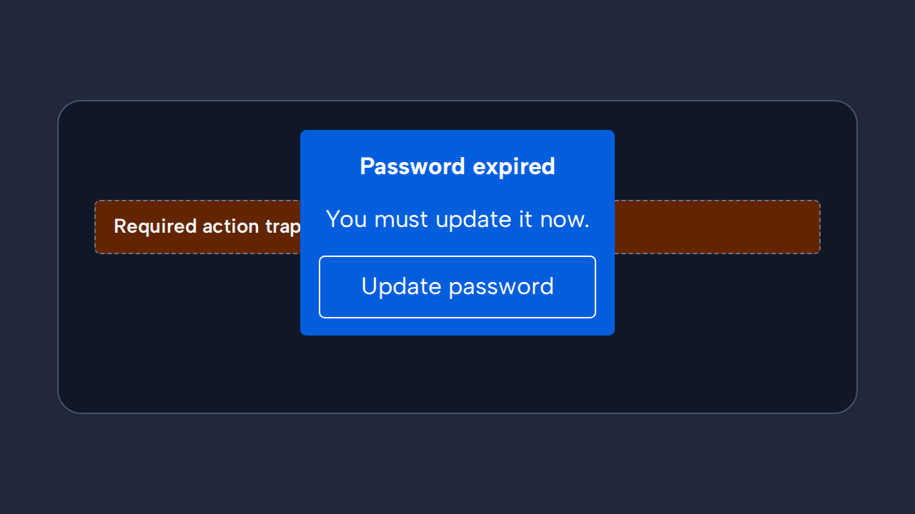
Keep controls and information people must act on outside the transient Tooltip surface.
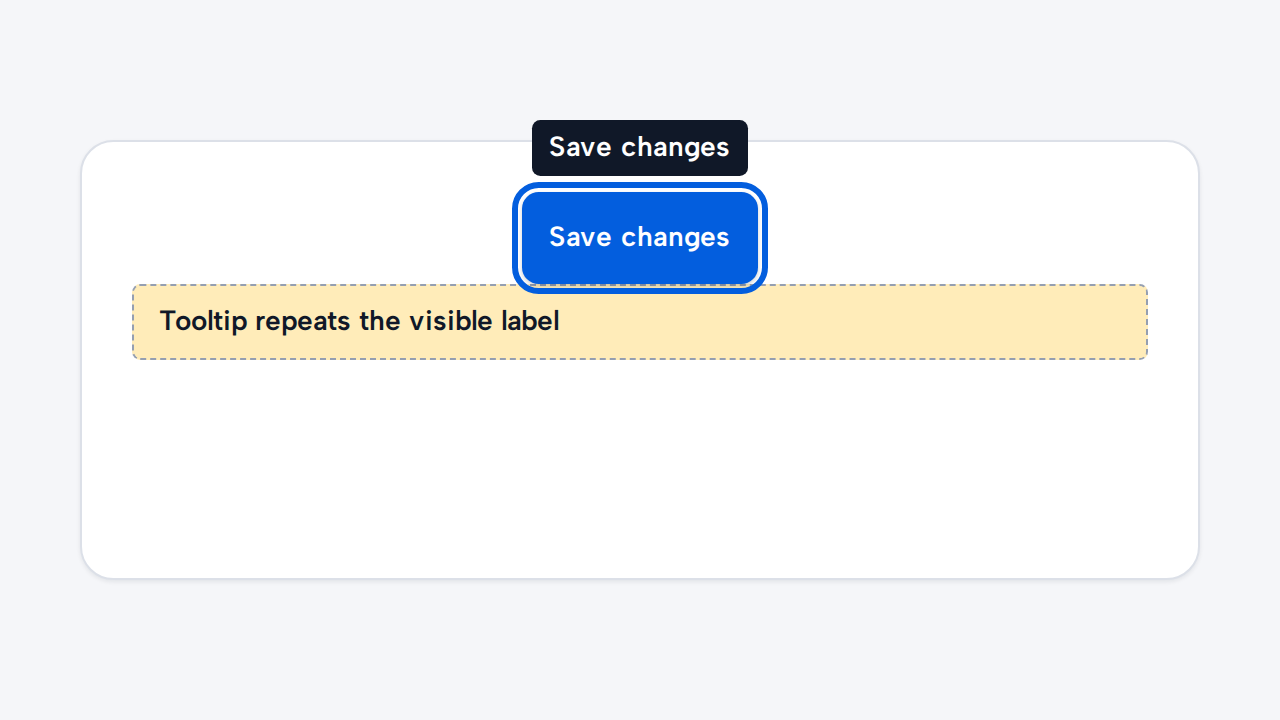
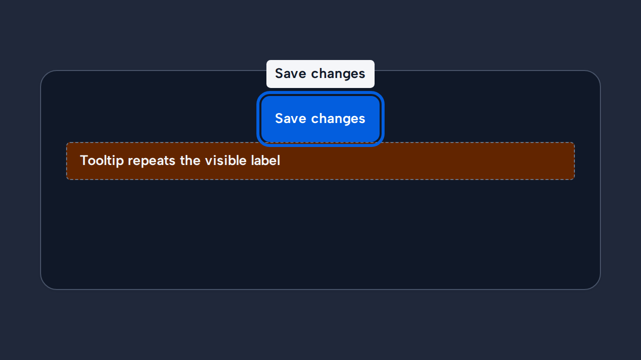
Improve an unclear control directly instead of repeating its visible label or compensating with a Tooltip.