

Creating themes
A theme changes how the system feels without forking how its components work. Keep component CSS on semantic tokens, then remap those roles to a deliberate set of Brand primitives for each supported Theme mode.
Start with the semantic contract
Section titled “Start with the semantic contract”Decide whether the change belongs to a Brand or a Theme mode before authoring tokens. A Brand changes visual identity—such as palette, typography, shape, and physical feedback. A Theme mode adapts that identity to an environment, usually light or dark. The two selectors are independent:
<html data-aidsgn-brand="offprint" data-aidsgn-theme="dark"></html>Do not add Brand names to component selectors. A Button should continue asking for color.surface.action; the active Brand and Theme mode decide which primitive fulfills that role.
1. Author private Brand primitives
Section titled “1. Author private Brand primitives”Create packages/tokens/src/brands/<brand>/primitives.json. Put the Brand’s raw palette, type recipes, shape, and motion ingredients below its own namespace. These are private implementation details, not new component styling APIs.
{ "aidsgn": { "offprint": { "color": { "paper": { "$type": "color", "$value": "oklch(97% 0.018 85)", "$description": "Warm uncoated-paper surface used as Offprint's light canvas." }, "ink": { "$type": "color", "$value": "oklch(22% 0.035 45)", "$description": "Near-black warm ink for Offprint text and primary actions." } } } }}Every leaf needs $value, $type, and a $description that explains intended UI use, acceptable contexts, and any accessibility constraint. Prefer a small, coherent vocabulary over cloning the default primitive scales.
2. Override semantic roles by mode
Section titled “2. Override semantic roles by mode”Add light.json and dark.json beside the primitives. Each override must match an existing path and type in packages/tokens/src/semantic/default.json, and it must reference a primitive directly.
{ "aidsgn": { "offprint": { "light": { "color": { "surface": { "default": { "$type": "color", "$value": "{aidsgn.offprint.color.paper}", "$description": "Warm paper canvas for Offprint light mode." }, "action": { "$type": "color", "$value": "{aidsgn.offprint.color.ink}", "$description": "Ink surface for primary Offprint actions." } } } } } }}Override only roles whose expression changes. If the Brand needs a distinction the contract cannot express—such as Offprint’s ink actions versus vermilion selection—add or refine the semantic role first, then update every Brand and mode consistently.
What Offprint changes
Section titled “What Offprint changes”Offprint remaps the same roles to warm paper and ink, vermilion selection, square control geometry, restrained press feedback, and editorial serif typography. The screenshots below capture specimens rendered from the authored token JSON, making the effect of those mappings visible without changing component markup. They follow this documentation site’s resolved Light or Dark mode.
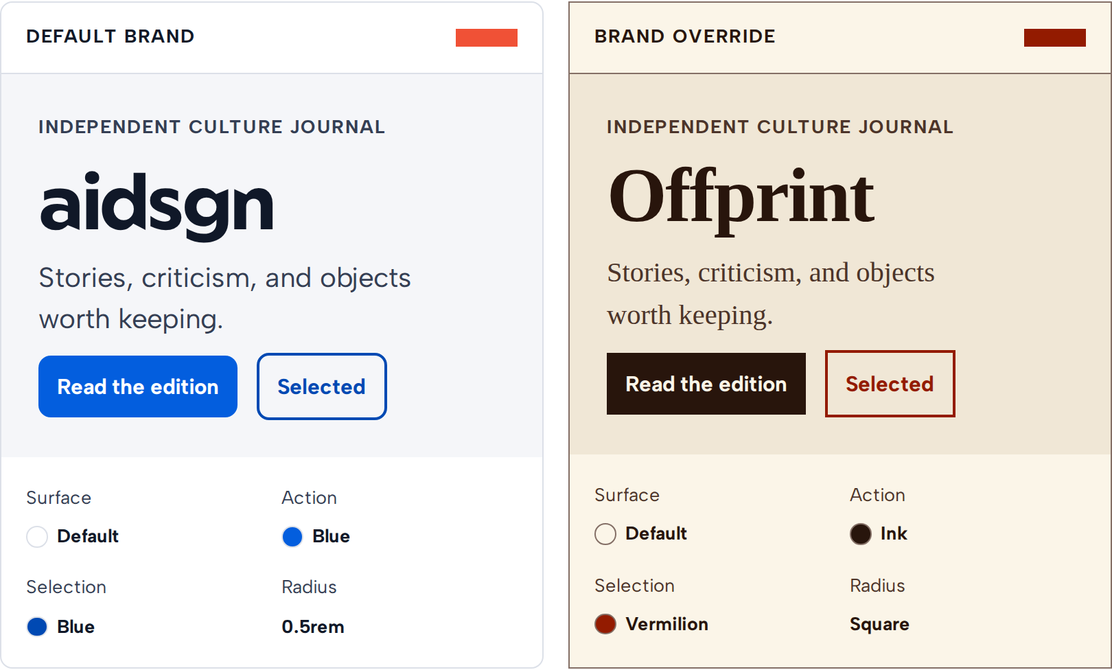
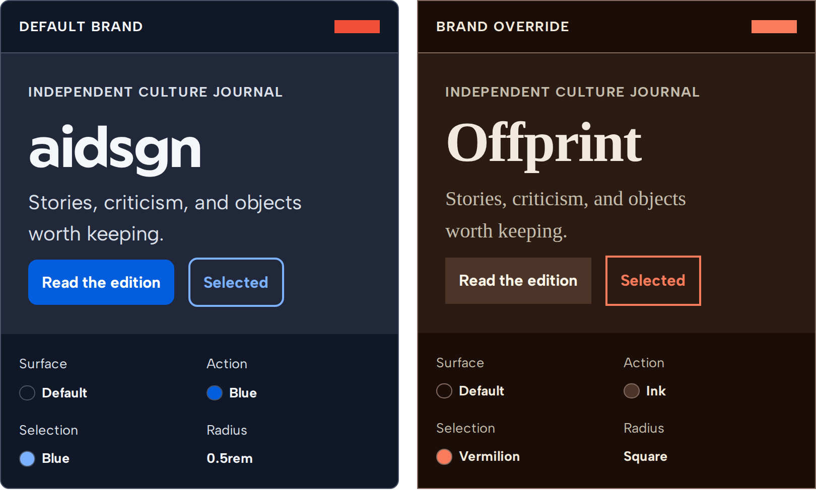
| Shared role | aidsgn expression | Offprint expression |
|---|---|---|
color.surface.default |
Neutral white | Warm paper |
color.surface.action |
Blue | Ink |
color.surface.selected |
Blue | Vermilion |
control.radius |
Medium radius | Square |
typography.body and headings |
Geometric sans | Editorial serif |
press-feedback.scale |
0.94 |
0.97 |
3. Generate and export the bundle
Section titled “3. Generate and export the bundle”Add a Style Dictionary build target that combines the shared semantic contract with the Brand primitives and both mode files. Emit the Brand into its own CSS bundle so applications that do not use it do not pay for its private primitives. Then expose that bundle from packages/tokens/package.json.
Build tokens and import the Brand bundle after the base entry point:
@import "@aidsgn/tokens/css";@import "@aidsgn/tokens/brands/offprint.css";pnpm --filter @aidsgn/tokens buildThe generated selectors provide a light fallback, follow prefers-color-scheme when data-aidsgn-theme is absent, and honor explicit light or dark mode on the same root element.
4. Verify the complete theme
Section titled “4. Verify the complete theme”Treat a theme as complete only after checking the whole semantic contract:
- Run token validation so unknown paths, type mismatches, missing metadata, and indirect aliases fail before CSS is emitted.
- Test foreground/background pairs in both modes against WCAG 2.2 AA. Include hover, focus, selected, disabled, status, tooltip, and modal treatments.
- Compare representative components in every supported framework and viewport. Typography and square geometry often reveal overflow or spacing assumptions that a palette-only review misses.
- Verify System, Light, and Dark selection independently from Brand selection, including the initial page load before JavaScript runs.
- Document how consumers import and select the bundle, and add visual regression coverage for its defining treatments.
Use the Storybook Brand and Theme-mode toolbars for live component comparison. Keep the default Brand selected by omitting data-aidsgn-brand; remove data-aidsgn-theme when the application should follow the operating-system preference.
Product applications do not need to add their Brand to this repository to use the Tailwind integration. They can define the shared --aidsgn-* semantic variables under their own data-aidsgn-brand light, dark, and automatic selectors; the same bg-aidsgn-*, text-aidsgn-*, rounded-aidsgn-*, and type-aidsgn-* utilities resolve through those values. The Tailwind CSS v4 guide includes a consumer-owned Brand example.