

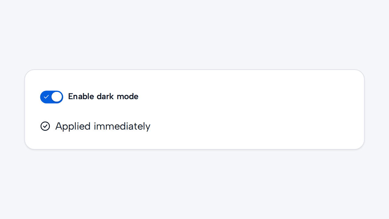
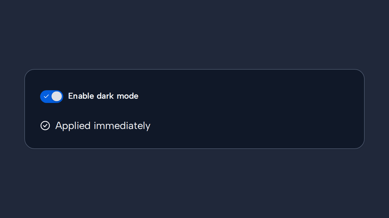
Do
Apply changes immediately
Use Switch for a setting whose effect begins as soon as its state changes.
aidsgn-switch is a native checkbox exposed as role="switch" and shown as a track with a moving thumb. Its appearance deliberately differs from Checkbox so users can recognise an immediate setting.
Its default 36×20px track contains a 16px thumb and a 10px decorative active check, inside a content-bound target with a 36px minimum block size. These dimensions scale with the root text size; there are no public size variants.
Use helper-text for setting guidance. error-message renders an associated error and implies invalid state; invalid marks the native switch with aria-invalid without requiring a message. Helper and error messages occupy separate inert rows and default to a 65ch maximum measure through --aidsgn-field-message-max-inline-size.
<aidsgn-switch class="aidsgn-switch" checked label="Enable notifications" input-id="notifications"> <span class="aidsgn-switch__control"> <input class="aidsgn-switch__input" id="notifications" type="checkbox" role="switch" checked aria-invalid="false"> <aidsgn-icon class="aidsgn-switch__check" name="check" aria-hidden="true"><svg class="aidsgn-icon__svg" viewBox="0 0 24 24" fill="none" stroke="currentColor" stroke-linecap="round" stroke-linejoin="round" stroke-width="2" focusable="false" aria-hidden="true"><path d="M20 6 9 17l-5-5"></path></svg></aidsgn-icon> </span> <label class="aidsgn-switch__label" for="notifications">Enable notifications</label> <p class="aidsgn-field-message aidsgn-field-message--helper" hidden> </p> <p class="aidsgn-field-message aidsgn-field-message--error" aria-live="polite" hidden> </p></aidsgn-switch>Use Switch when toggling takes effect immediately. The label is linked to the native control, so it is clickable and exposed to assistive technology.
The host fills the width assigned by its parent while the indicator-and-label target remains content-bound. Give each host an explicit layout cell when arranging Selection controls horizontally.
Holding an enabled Switch compresses its track, thumb, and check as one unit without changing the target. The checked treatment remains separate, and reduced motion suppresses the press scale.
Use Switch for a setting whose effect begins as soon as its state changes.
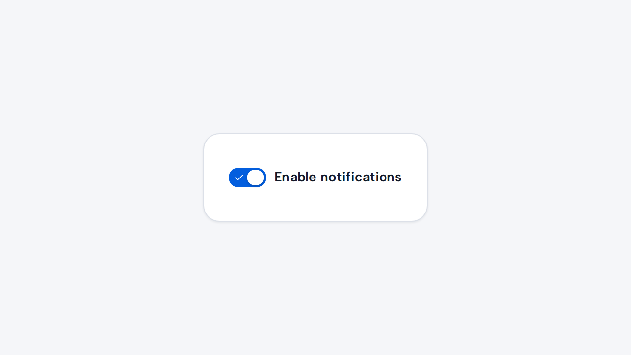
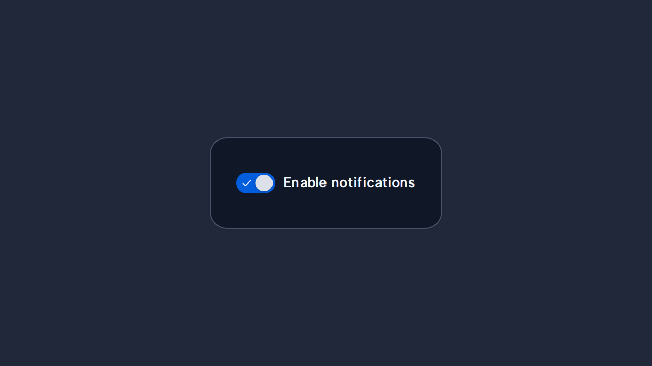
Phrase the label positively, such as “Enable notifications,” so the on and off meanings remain clear.
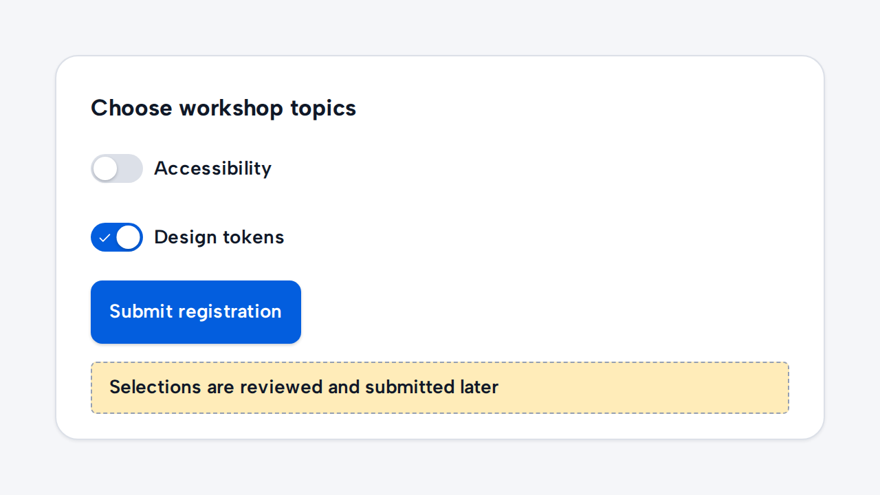
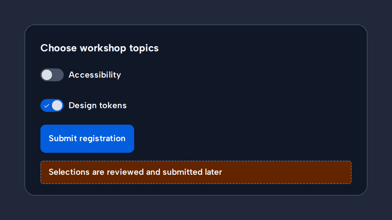
Use Checkbox when people select items to review and submit together later.
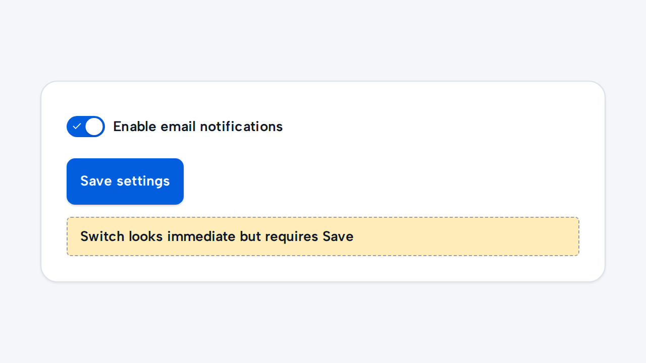
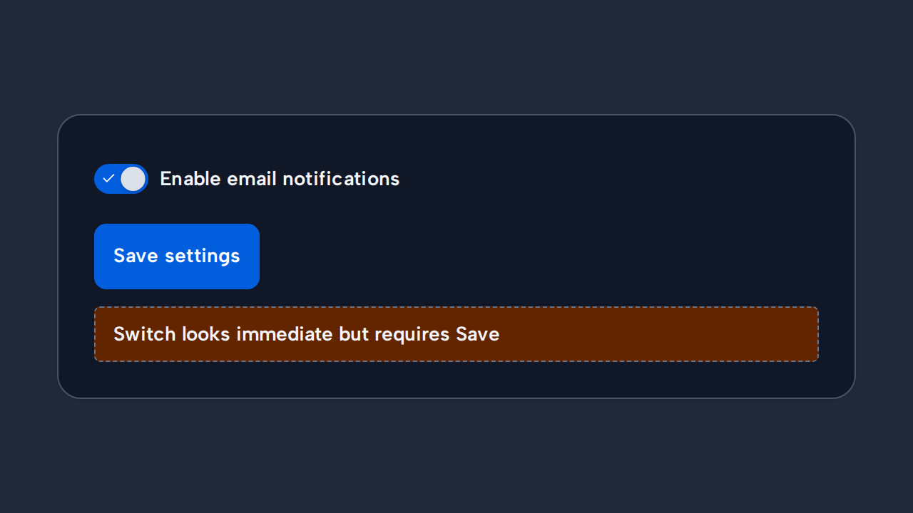
Do not require a separate Save action unless the interface clearly explains that the setting is not immediate.