

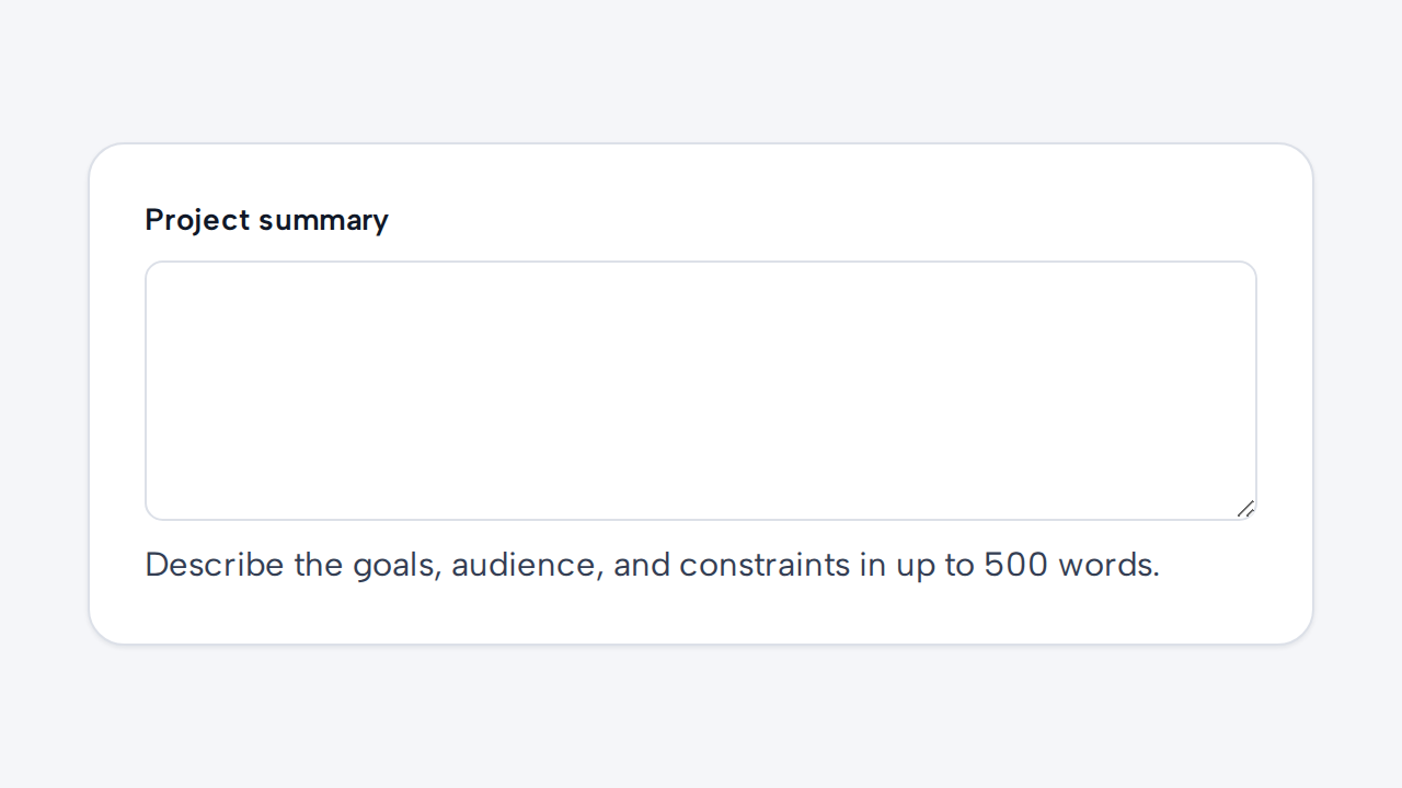
Do
Invite multi-line responses
Use Textarea for free-form content and explain any useful length or format expectations.
aidsgn-textarea is a native multi-line text control. label creates a visible native label linked to the textarea; use it for every field. A placeholder is only a short example or hint. The field fills its parent’s available width by default; constrain or arrange the host from the parent layout.
Use helper-text for guidance. error-message renders an associated error and implies invalid state; invalid marks the native textarea with aria-invalid without requiring a message. Field messages wrap within the available width and default to a 65ch maximum measure; customize it with --aidsgn-field-message-max-inline-size.
<aidsgn-textarea label="Project summary" input-id="project-summary" name="summary" required placeholder="Describe the project" rows="4"> <label class="aidsgn-textarea__label aidsgn-is-required" for="project-summary">Project summary</label> <textarea class="aidsgn-textarea" id="project-summary" name="summary" required placeholder="Describe the project" rows="4" aria-invalid="false"></textarea> <p class="aidsgn-field-message aidsgn-field-message--helper" hidden> </p> <p class="aidsgn-field-message aidsgn-field-message--error" aria-live="polite" hidden> </p></aidsgn-textarea>Use disabled when the field is unavailable and readonly when its value may be copied but not edited. Both states retain the label and visibly differ from an editable field.
Use Textarea for free-form content and explain any useful length or format expectations.
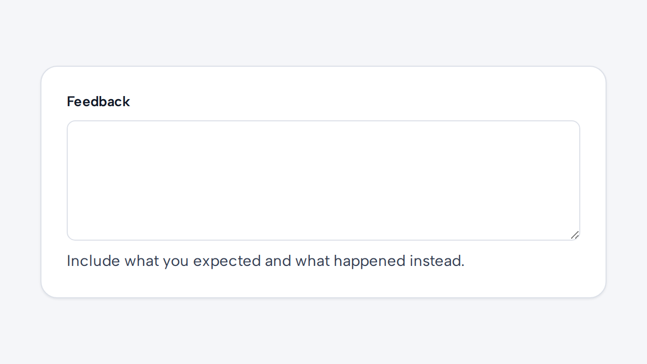

Provide a visible label and programmatically connect helper or error text to the Textarea.
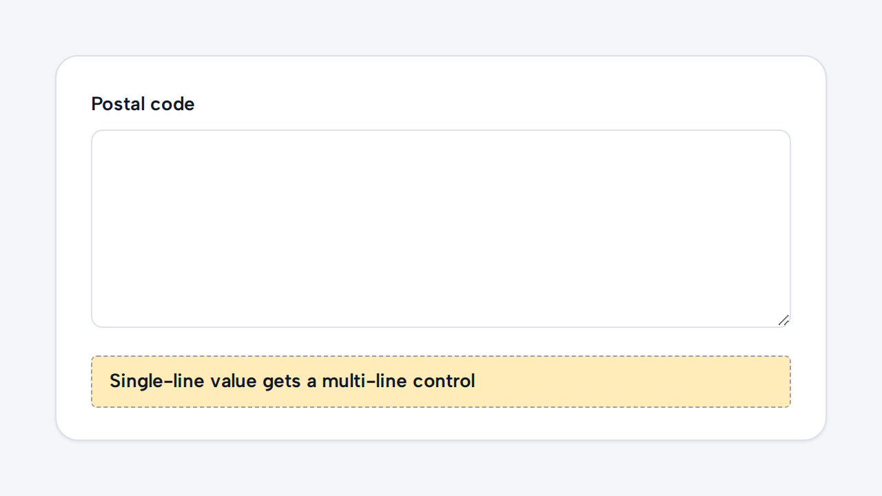
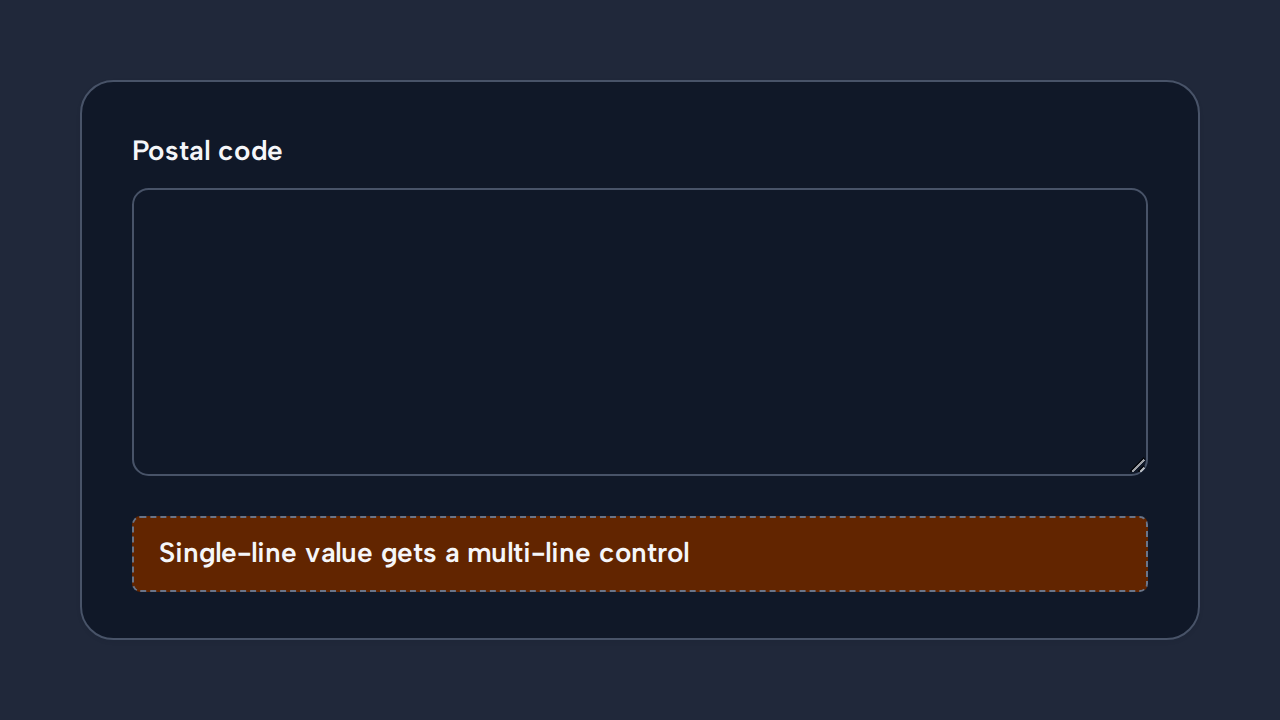
Use Input when the expected response fits naturally on one line.
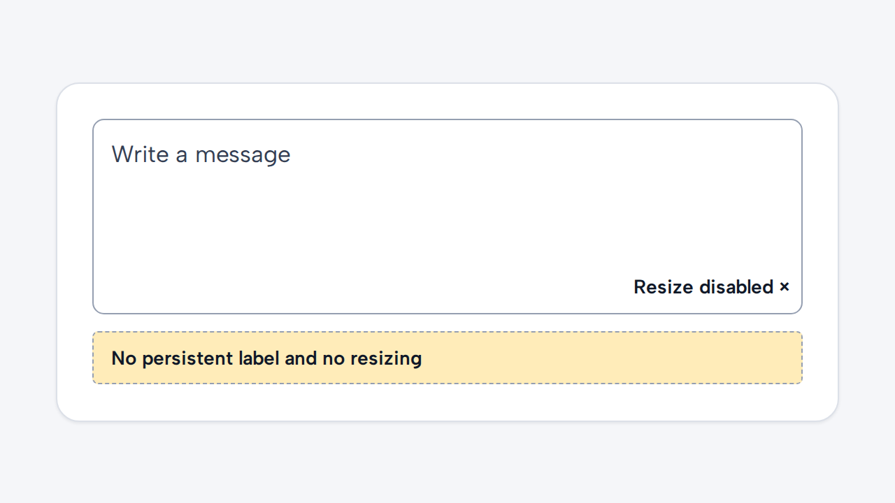
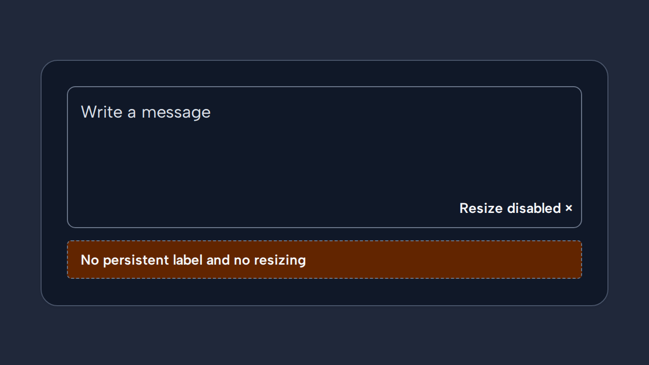
Do not prevent resizing or use disappearing placeholder text as the control’s only label.