

Carousel
aidsgn-carousel progressively enhances an authored frame, viewport, track, slides, controls, and pagination into a horizontal scroll area. Pagination follows direct scrolling immediately while its screen-reader status waits for scrolling to settle. The scrollbar stays hidden while touch, pointer, trackpad, and keyboard scrolling remain available.
<aidsgn-carousel class="aidsgn-carousel" label="Featured stories" per-page="2" preview-size="3rem" gap="0.75rem" simulate-touch><div class="aidsgn-carousel__frame"> <div class="aidsgn-carousel__viewport" tabindex="0"> <div class="aidsgn-carousel__track"> <div class="aidsgn-carousel__slide" role="group" aria-roledescription="slide" aria-label="1 of 3" data-aidsgn-current><article class="aidsgn-carousel-demo__slide"><strong>Design for the platform</strong><span>Native scrolling stays responsive across input methods.</span></article></div> <div class="aidsgn-carousel__slide" role="group" aria-roledescription="slide" aria-label="2 of 3"><article class="aidsgn-carousel-demo__slide"><strong>Keep content in light DOM</strong><span>Semantics, inspection, and application styling remain available.</span></article></div> <div class="aidsgn-carousel__slide" role="group" aria-roledescription="slide" aria-label="3 of 3"><article class="aidsgn-carousel-demo__slide"><strong>Enhance progressively</strong><span>Without JavaScript, authored content remains visible in document order.</span></article></div> </div> </div> <div class="aidsgn-carousel__controls"> <button class="aidsgn-carousel__button aidsgn-carousel__button--previous" type="button" aria-label="Previous story" disabled><aidsgn-icon name="chevron-left" aria-hidden="true"><svg class="aidsgn-icon__svg" viewBox="0 0 24 24" fill="none" stroke="currentColor" stroke-linecap="round" stroke-linejoin="round" stroke-width="2" focusable="false" aria-hidden="true"><path d="m15 18-6-6 6-6"></path></svg></aidsgn-icon></button> <output class="aidsgn-carousel__status" aria-live="polite" aria-atomic="true"><span class="aidsgn-carousel__status-text">1 of 2</span><span class="aidsgn-carousel__pagination" aria-hidden="true"><span class="aidsgn-carousel__pagination-dot" data-aidsgn-current></span><span class="aidsgn-carousel__pagination-dot"></span></span></output> <button class="aidsgn-carousel__button aidsgn-carousel__button--next" type="button" aria-label="Next story"><aidsgn-icon name="chevron-right" aria-hidden="true"><svg class="aidsgn-icon__svg" viewBox="0 0 24 24" fill="none" stroke="currentColor" stroke-linecap="round" stroke-linejoin="round" stroke-width="2" focusable="false" aria-hidden="true"><path d="m9 18 6-6-6-6"></path></svg></aidsgn-icon></button> </div></div></aidsgn-carousel>Provide a content-specific label. Author Previous and Next buttons with previous-label and next-label to localize them. Set per-page to the number of complete items to show, preview-size to reveal part of the next item, and gap to control the space between items. They default to 1, 0px, and the system’s regular spacing respectively.
Holding an enabled Previous or Next button applies shared Press feedback without replacing its hover treatment or changing its 44px target.
Add simulate-touch when mouse users should be able to hold and drag the viewport. Add loop only when Previous and Next should wrap between the first and last pages. Both behaviors are disabled by default. Authored items remain the only semantic and focusable content.
There is deliberately no autoplay. Reduced-motion preferences remove smooth scrolling, Press scaling, and control transitions, while the focusable viewport keeps native scrolling commands available. Use a normal list or grid when users need to compare every item at once.
Usage guidelines
Section titled “Usage guidelines”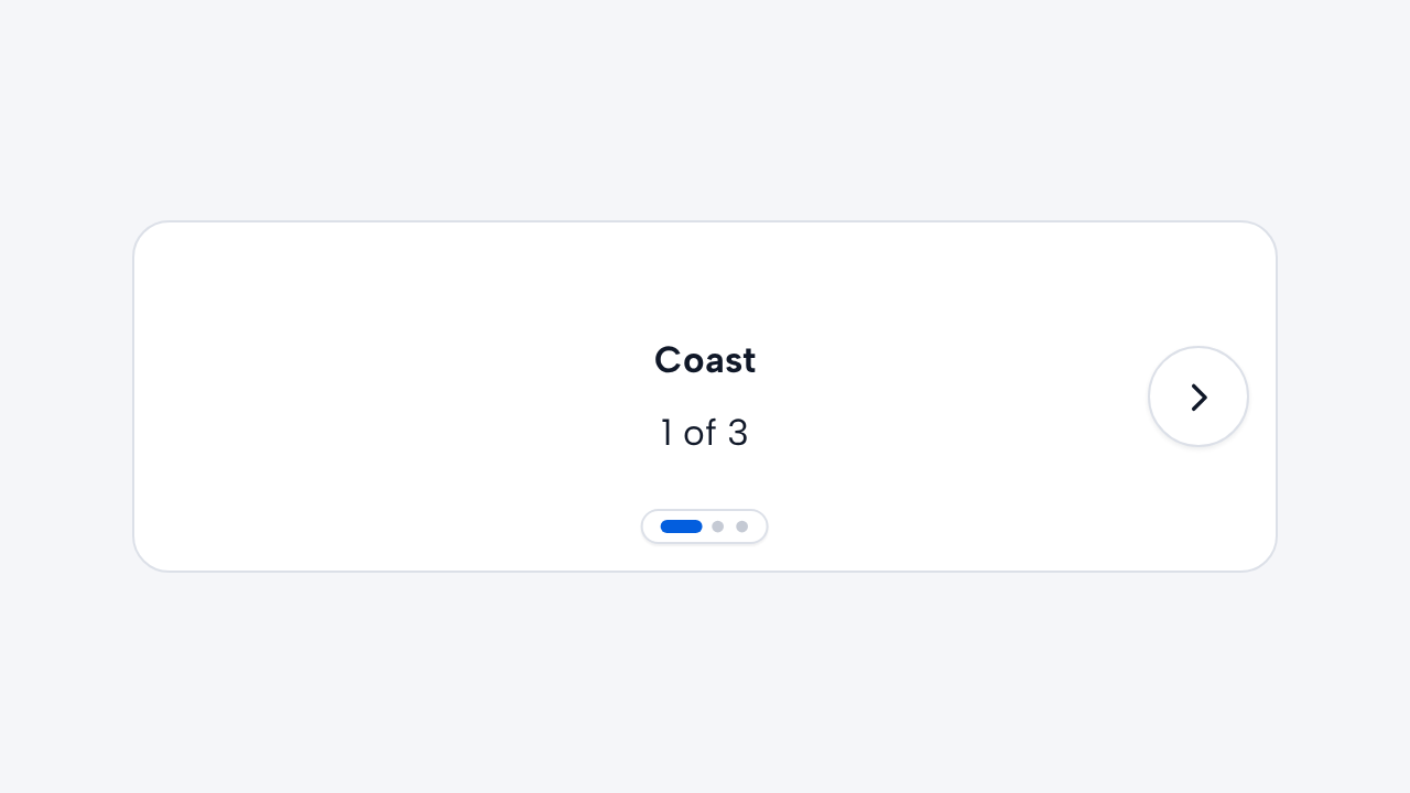
Do
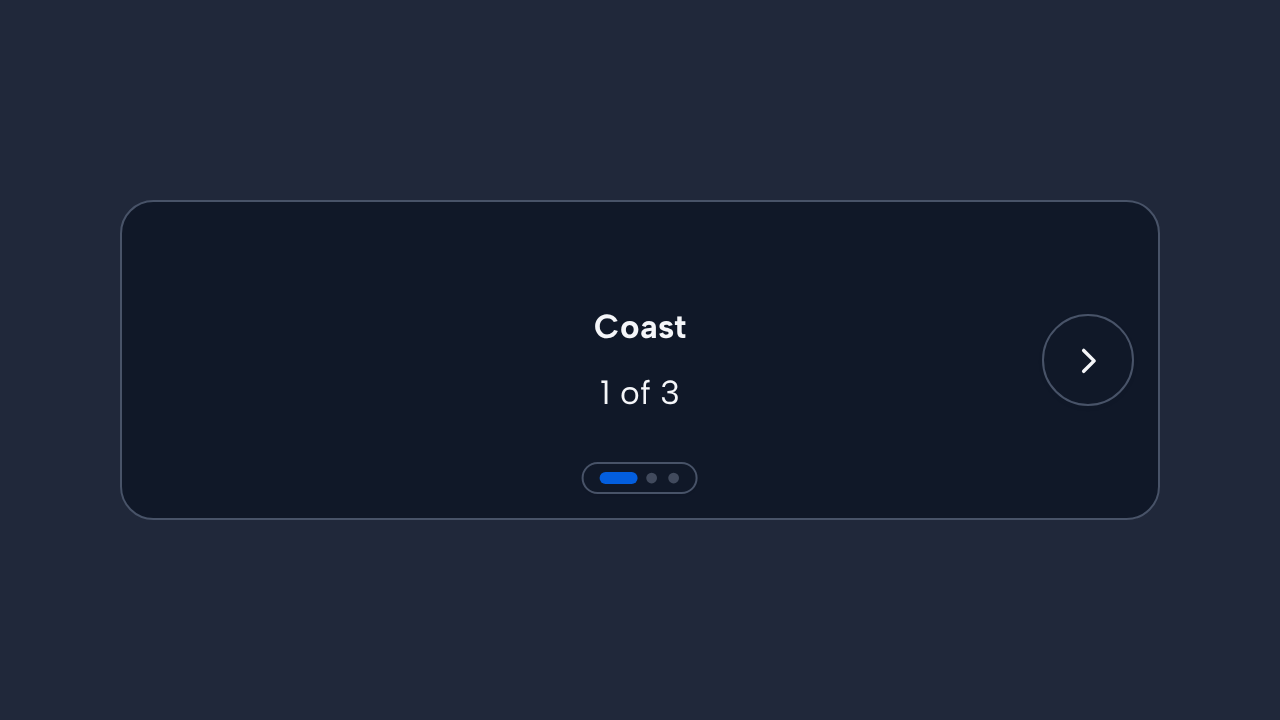
Name and order the collection
Provide a meaningful label and keep slides in a logical source and reading order.
Do
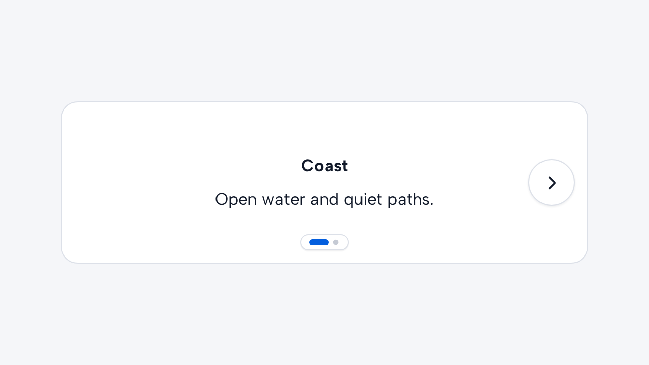
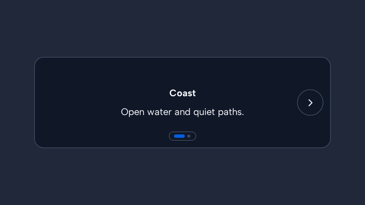
Keep navigation controls visible
Show controls whenever additional content can be reached so discovery does not depend on gestures.
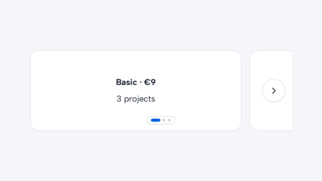
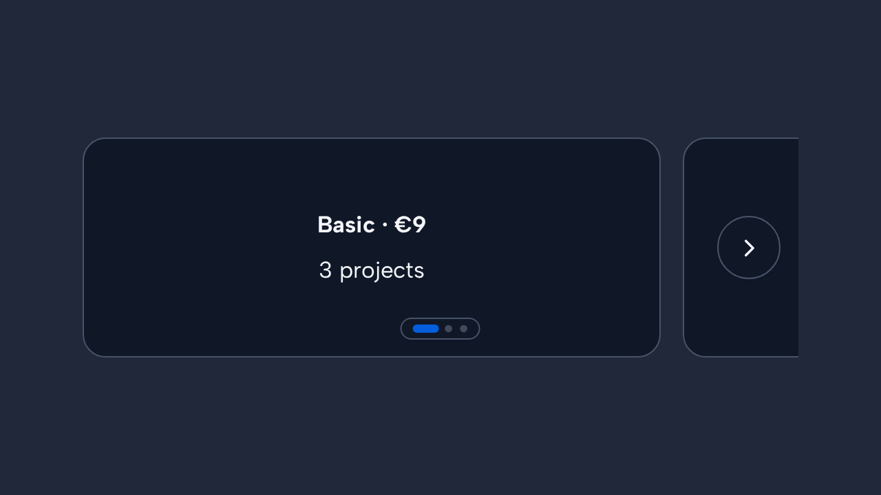
Don’t
Avoid side-by-side comparison
Use a layout that keeps all options visible when people must compare their details directly.
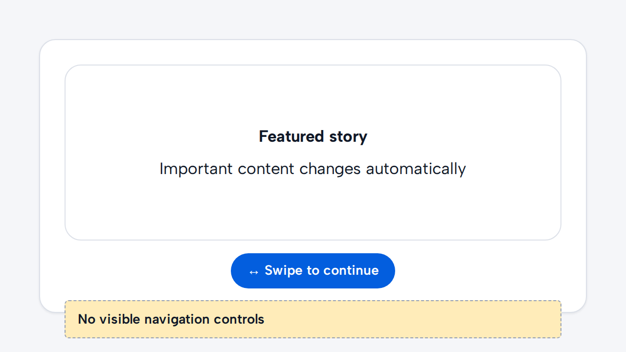
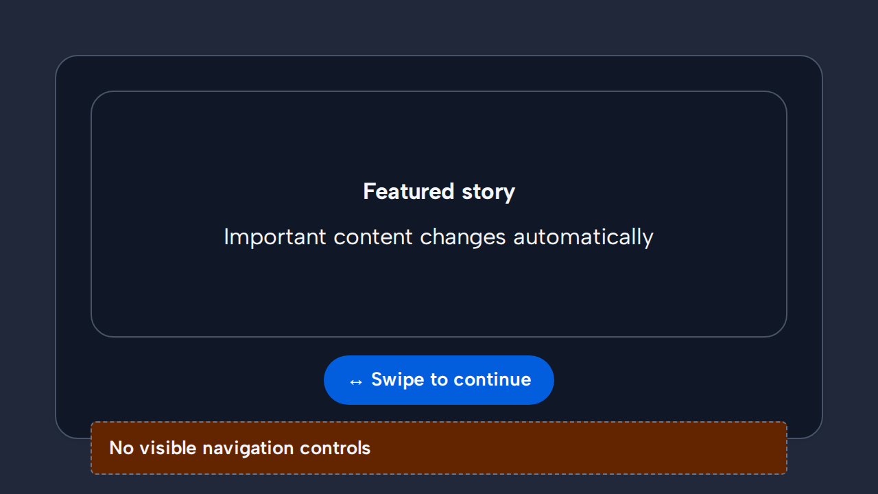
Don’t
Never hide control behind motion or gestures
Do not auto-advance important content or make swiping the only way to reach another slide.